Space Zoning
The designer-clientele demographic of today are inkling towards more open floor plans for their habitable/commercial spaces. This approach to spatial planning kindles a sense of freedom and enhances the visual & physical familiarity of the space.
We see some big positives with this approach towards better management of space:
- It’s a big cost-saver as the need for secondary solid construction is minimised drastically.
- It is a space saver, granting you additional sq footage that in normal circumstances would have been eaten up just for partitioning.
- It’s a very versatile method to bring in variations in design style and depth
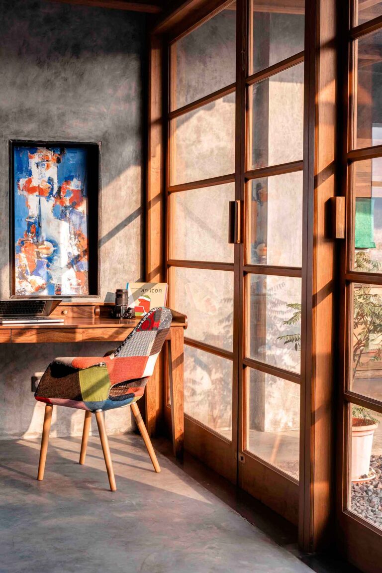
If you like this image above, do visit our feature on Veranda on a Roof
The key to zoning spaces in open floor layouts is to still maintain the visual connection but with varying and playful levels of visual intensities. What’s most exciting is that through materiality and pattern, space can be zoned with refreshing renders as well.
In this article, we share with you a few easy ways in which you could apply zoning practices to plan out your spaces.
Zoning in physical form
Furniture
A singular piece of furniture is apt for this function and can include easy to move cabinetry, sideboard, countertop, or even a picnic bench.
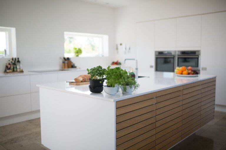
Photo by Rene Asmussen from Pexels
Choose a piece that is unique in finish and design, and treat it as a highlight decor element in your space. This way it participates in the decor and does not become a redundant addition.
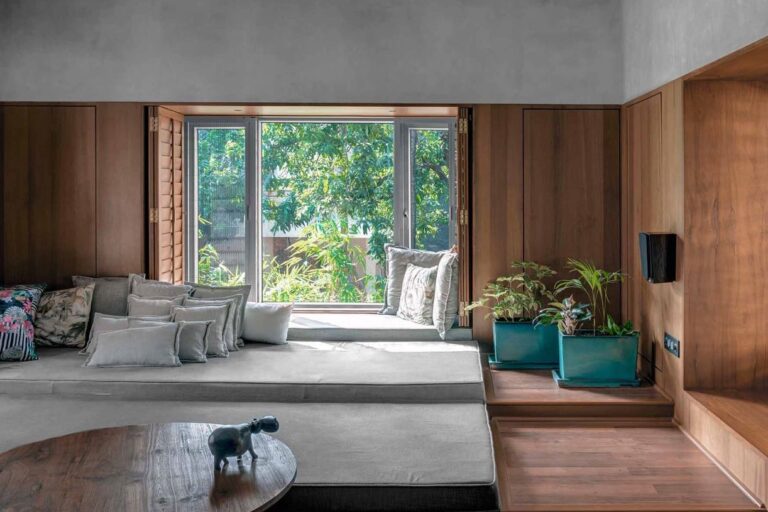
Level differences
If you like this image above, do visit our feature on T House
Space and its function can be highlighted with a simple increase or decrease in elevation.
If this is an afterthought post-construction of your floor slab, an easy to assemble hardwood platform is the forward.
This zoning practice works well to highlight the seating arrangement of your living space or to create a vantage platform beside a bedroom window imitating a bay window.
Plants
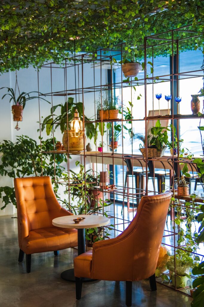
Photo by Valeria Boltneva from Pexels
Movable vertical green scapes always adds a hint of freshness into any space. Mount a standing vertical metal grid/rack with an assortment of dense foliage creepers and planters and you are good to go!
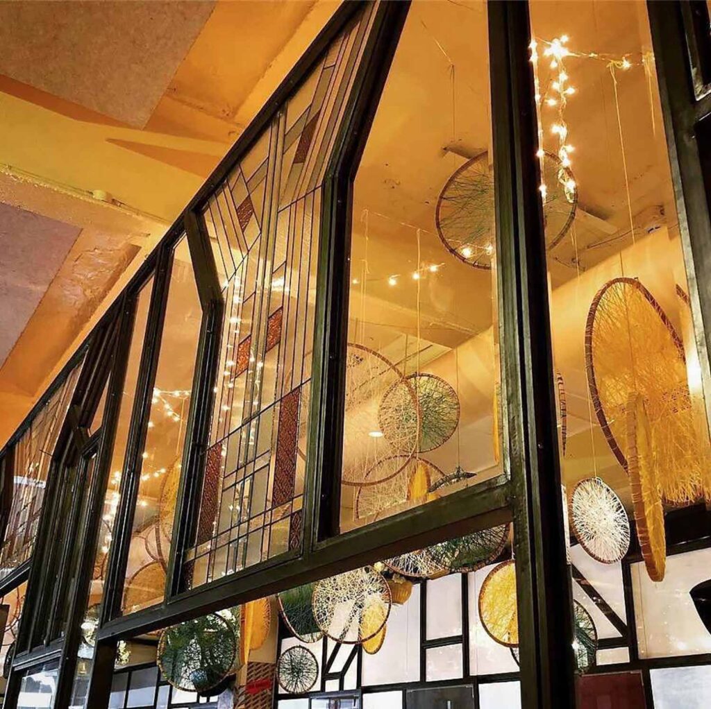
Screens and sliding shutters
Some of our favourites include oils on canvas room dividers, a series of antique door/window/mirror shutters, sheer raw natural fabrics, framed straw and rattan, framed crushed paper/fabrics, carved wood jaali screens, laser-cut brass/copper screens, mandala screens, stained glass mosaics, ribbed glass.
If you like the image above, do visit our feature on Bombay Canteen for more on screens and shutters
Since these screens possess their own aesthetic sense, we suggest treating them as a decorative element and include them in the design language of your space.
Shelves or cabinetry
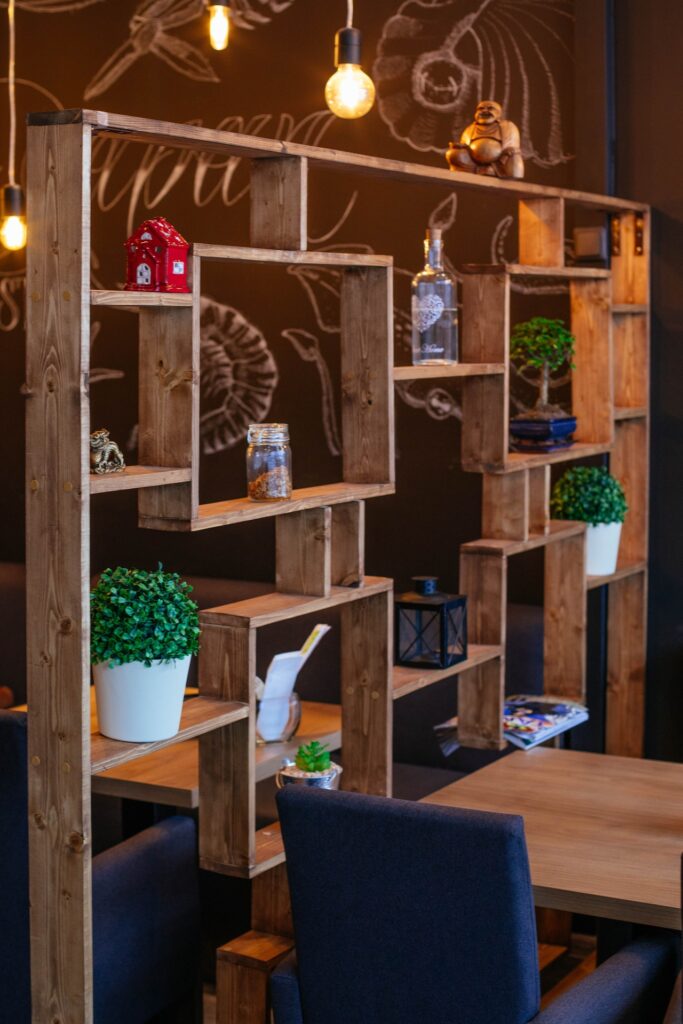
Photo by Valeria Boltneva from Pexels
A two-way open shelf system that spans floor to ceiling decorates spaces on either side of it. It can be used to showcase an assortment of objects like books, planters, memorabilia and statuettes. Using storage elements like this for zoning purposes comes in handy in small spaces.
Virtual zoning
These are the latest practices in town where the term ‘minimalism’ finds its way into more and more spaces. Their approach is territorial and brings the circumambient space to the fore, reducing physical forms of obstruction of any kind.
Material transitions
If you like this image above, do visit our feature on the Blue House for more on Material transitions
The best material juxtapositions come to light when they are greatly contrasting in palette and texture. For e.g, Kota tile to hardwood flooring, exposed walls to plastered, polished cement floors to tile etc.
Colour transitions
If you like the image above, do visit our feature on Hello Yellow for more on Color transitions
Assigning a colour scheme for each space can zone spaces very distinctly on a visual level. The more the contrast in tone, the more apparent becomes the space separation. The juxtaposition however makes for very striking compositions.
Pattern and print transitions
If you like the image above, do visit our feature on Frangipani 14 for more on Pattern transitions
Using one detailed dominant pattern with two or more simpler ones of a similar style calibre, works great to define a single space. A transition best comes into effect when there is a change in pattern/print language from space to space, for example, chintz & stripes to geometric & grunge etc.
With all the possibilities and options listed above, bring out that creative side in you and discover design through this unique method of space making.
Hope this feature was helpful
If you have a unique style of zoning your spaces, we would love to hear about it
Discover similar articles
Why Southeast Asians Are Investing in Homes Abroad

Most Influential Spatial and Interior Designers You Need to Know in Singapore 2025

How to Zone Open Floor Layouts Without Walls

How To Apply The ‘Nudge Theory’ For A Better Lifestyle

Modern Sideboards With a Vintage-Inspired Look

How to Transform Your Home Workstation into a Stylish Productivity Zone

How To Be Creative With Your Living Space Furniture

Why We Love the UOB Card as a Lifestyle Companion
UPDATED! A Shopper’s Guide: Catch the Latest Trends at these Pop-Up Stores

XM Studios: The Ultimate Destination for Comic Book Collectibles in Singapore

Your Guide to Cocktails Inspired by Singapore’s Most Famous Landmarks

Why Emotional Water Bottles Are TikTok’s Latest Obsession for Self-Care and Hydration

Tech Meets Art: The Creative World of Keyboard Customization

An Artistic 21-day Holiday Experience You Don’t Want to Miss

Amazon Prime Day 2024: Your Guide to the Ultimate Home & Decor Savings
Copyright © 2026 DSGN arcHive


