
Project Specifications
- Project name: Hello Yellow
- Location: Kerala, India
- Area: 1010 sqft
- Name of Architecture & Interior Design Firm: Humming Tree
-
Project Team:
Principal Designers: Afnan & Arun -
Vendors
Light Fixture: LIGHT, Calicut
Aesthetic shift
In prior articles, we talk about some of the newest trends in workplace design, where creatives are now averse to the pedestrian makeup of “suitable/acceptable” office spaces. That dull, formal, mundane, ‘all too familiar’ look is being chucked out of the window, inkling designers towards the opposite and more vibrant end of the spectrum.
An impressive office space design by the name ‘Hello Yellow’, jumped into the DSGN arcHive radar and we couldn’t be more than glad to share its refreshing look and feel with you! In this article, the Principal architects of Humming Tree, Afnan & Arun, share with us their go-to practices towards peppier workspace environments. Their unique and out-of-the-box approach towards the project conceives a design that truly jumps off the page, leaving one awestruck by the bold and striking compositions.
The design takes great inspiration from the anatomy of contemporary art galleries. This concept is packed into an ‘L’ shaped layout, where the many attributes to the unique design come to life within a carpet area of 1010 sq ft.
The office space caters to a small workforce, and spans across a West facing reception and guest lounge, a cabin for the office manager, workspace for 4 office employees and a conference room at the far end of the layout.
Let’s jump right in and unravel their rulebook to chic-er workplace environments!
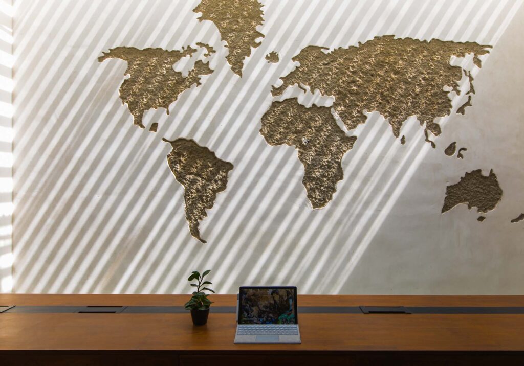
Wall art
“Boring plain walls with no art?
Life is just too short for that!”
‘Hello Yellow’ manifests the essence of what the creatives at Humming Tree preach. The approach towards wall art curation seen across the project keeps to striking compositions and in sparse numbers. What’s most notable is that the artworks do not overwhelm and politely add a touch of finesse, adhering to the colour-palette of the space. The office is accessorized by a tasteful art vocabulary including mid-century modern abstract art prints by Matisse and Kadinsky, Scandanavian geometric art and organic marble patterns.
This crisp, clean, minimal, elegant, bold design vocabulary is also assigned to the wall-mounted office signage. It artfully manifests a sleek finish of black letters against a bright yellow contrast of wall, as if classically handwritten with black ink.
Bold design
“Go Bold or Go home!
Office spaces with unique interior features will always add spark to the conversation and give the overall experience a distinct vibe that makes both employees and guests feel special and connect with the business better.”
BOLD WITH COLOR
Colour used for brand identity
Colour is indeed the signature element to the design language of ‘Hello Yellow’.
Each space is primarily composed of 3 very contrasting colours: yellow, black and white. As the name ‘Hello Yellow’ suggests, yellow is the dominant colour used across the design scheme and generously lathers across the horizontal and vertical dimensions of each space.
The uniqueness of this palette is its wide spectrum of contrast, which is generally an approach that is lesser chartered in conventional office space interiors. The bold selection of an electric tone like yellow is also lesser-visited for its ability to overwhelm a space.
Colour used as a zoning tool
To avoid the “overwhelm”, the team devised a zoning approach, introducing neutrals into the composition to break the monotony of yellow. Each zone demarcates with one colour and that colour takes full reign of the space from ceiling to floor. This kindles a striking monolithic effect of each zone.
The best example of this is seen at the reception of the ‘Hello Yellow’ office which appears dipped in yellow, while the waiting lounge appears dipped in black and white.
Colour used to highlight function
Colour is also used as a tool to differentiate between functions, clearly demarcating spaces for office use and that for guests. While office employees traverse along with bright and sunnier spaces like the reception, corridors and conference room; their guests get to experience a more reserved yet stylish waiting lounge in black and white.
Colour in flat
The overall look mimics a flat painting and minimizes the use of textures, creating a comfortable visual. This approach is different to the design of most builder’s offices where exposed materials and textures are brought to the fore.
BOLD WITH LIGHT FIXTURES
Light fixtures participate in a great way towards enhancing the very bold colour contrasts of ‘Hello Yellow’. Sporting pitch-black fitments in sleek and linear form, these custom-designed light fitments dress the space like swift pen strokes in black ink.
Two ceiling-mounted customized rod lights manifest this aesthetic at the reception of the office. While the conference room ceiling is dressed with many lights of a similar calibre, with additional dynamic attributes. The fitments in the manager’s lounge adhere to the scheme and are malleable.
BOLD WITH FURNITURE
Stylish black mesh chairs add to the sketch effect against the brightly coloured spaces, as seen in the reception, workspace, and manager’s cabin. A pop of Prussian blue suddenly gets introduced into the colour scheme with the sofa in the waiting lounge. A colour overflow from the waiting lounge occurs in an attempt to visually marry its aesthetics with the rest of the office in the form of black & white chairs. They take their place at the custom-built pearl white table of the conference room and manager’s cabin.
BOLD WITH DECOR
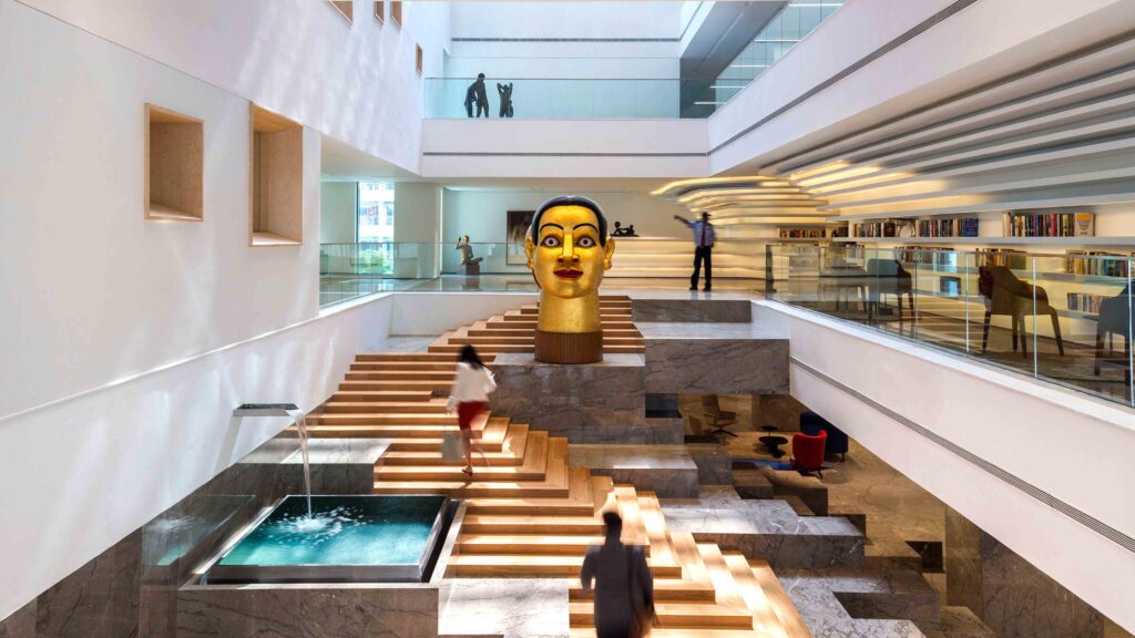
‘Hello Yellow’ showcases replicas of very unique and world-famous statuettes in their reception and conference rooms, bringing in character into the office. Namely, Jeff Koon’s dog designed by Jeff Koon that sits on the reception capsule desk, initiating a playful visual. The ‘Eames crow’ designed by Charles and Ray Eames, nurtures a sleek and formal setting.
Indoor Landscape
“Always & always dip greens and landscape out in office spaces like 10/10, it not only adds charm but has a lot of positive benefits.”
‘Hello Yellow’ not only accommodates plants to spruce up the work environment but also leverages this quality off specific plant types to add to the signature of the space.
Across the project, the creatives add xeriscape plants to the design scheme, specifically the ‘San Pedro’ cactus. Besides possessing a bold architecture-like silhouette, the plant is also low maintenance.
A whisper of tropical plants like the Monstera deliciosa seen at the reception, complement well with the lush yellow aesthetics. Rubber plants add a bit of sheen to the lounge space with their large glossy leaves.
The conference room sports a complete green wall which is beautifully amplified with mirrors towards the opposite end of the room. The green wall comprises a glazed wall, veiled delicately by tropical travellers’ palms spanning its entire length. This design feature not only adds that element of freshness into the everyday rigmarole of an “office routine”, but also provides a genteel and calming filter of daylight across the room.
Unique features
“Lastly, make sure there is some unique feature design in any of the spots in the office so people talk about it and this becomes a good branding for the office itself.”
‘Hello Yellow’ renders a sense of identity to each of its spaces, via a composition of unique aesthetic elements of different size, shape and form.
The variety of elements that participate and how they take their stage creates an ever-changing visual frame through the course of the user journey making the experience flavorful. The most prominent elements of the projects are the colour palette of each zone, light fixtures, furniture, wall art and tabletop art statuettes, indoor greenscapes.
Reception
Yellow washed space doodled upon by black elements like the glossy capsule desk, light fixtures and company signage. Spruced with a tropical planter and a playful blue Jeff Koon tabletop dog.
Waiting lounge
The experience of suddenly transitioning from the yellow reception space to a black & white lounge is the signature showcase here. Like the circumambient setting, the lounge attempts to acknowledge a whisper of colour with a chic Prussian blue couch.
Workspace & Manager’s cabin
Unlike the monolithic look of the reception and lounge, these spaces manifest a balanced tri-palette composition. They also accommodate neat cabinetry for clutter-free spaces.
Passage
Instils a veritable art gallery-like ambience, showcasing different wall-mounted art frames and unique plants.
Conference room
The tricolour palette resonates here as well and is enhanced by the refreshing glass wall screened with plants. The mirror reflection of this wall artfully amplifies this calibre.
Be part of a movement
We hope this project has sown a seed of inspiration amongst creatives or enthusiasts interested in workspace design. As the creatives of Humming Tree have rightly put, ‘life is indeed short’! So why not design/be part of an office anatomy that is inviting, refreshing, that adds a bit of theatre into our routines, and especially one that adds a great deal of vibrance into our lives.
Discover similar articles
Copyright © 2026 DSGN arcHive