ARTICLE CONTENTS
Project Specifications
- Project name: The Blue House
- Location: Mumbai, India
- Area: 1500 sqft
- Name of Architecture & Interior Design Firm: KARAN DESAI, Architecture + Design
-
Project Team:
Principal Designer: Karan Desai
Senior Designer: Nagesh Pawar
Junior Designer: Shrushti Hakani - Photography credits: Pulkit Sehgal
-
Vendors
Tiles - KLAY Store
Marble - CMC Silvasa
Wooden Flooring - HAVWOODS international
Furniture - Karan Desai HOME
Door Hardware - Hardware Renaissance
Kitchen - Akruti Kitchen
Lights - Abner Lights
Carpet - Colaba Carpet
Sanitary wares and fittings - Milagro Universe
Soft Furnishings - Bharat Furnishings
Loose Carpets - Hands
Furniture & Accessories - DEFURN
Master Bedroom Customized conical downlighter - ABBY Lighting
Bed Linens & Accessories - The Great Eastern Home
Your Scenario
You’ve bought a new home or you are looking to refresh your present one and its time to get into the nitty-gritty of interior finishes.
You are considering a fresh look for your pad. You’ve been scouring the internet and numerous interior design magazines for ideas and inspiration,
But where do you begin?
Let us take a plunge into one example of an interior design intervention, where large changes were not made to the original layout of the house.
A design where with a little bit of “out of the box thinking” translated into a contemporary, swanky and chic abode for a young family of 4.
“Understand the approach of the example we are about to study. It could apply to your scenario!”
Taking inspiration from the user - Blue House

Tucked away from the hustle and bustle of Mumbai city is perched a 3-Bhk apartment famously called the Blue House, home to a young couple and their two children. Looking for a classy revamp to their home, they approached Principal designer Karan Desai for his expertise in this arena.

His approach to interior design began by plucking hints and references from the family, their lifestyle, their likes and dislikes and of course their standard of living. This exercise was instrumental in boiling down key indicators to steer the project in a clear direction.
Few attributes that describe the family may be:
spiritual, classy, young, open-minded, experimental, creative
Great list of keywords to begin a treasure hunt for vocabulary compatible finishes and palette.
“See what attributes match your household. It’s a great way to start!”
Taking hints from a site analysis
Understanding the potential of the apartment and flexibilities was the very next step. As 90% of the standing walls were of RCC, a recomposition of layout turned out to be near impossible. Taking this in his favour, designer Karan Desai took to one approach that we are all waiting to hear about.
“A site analysis speaks volumes. Understand the potential of your home and take a call. This could involve the addition or subtraction of walls to change the layout of your home.”
The Blue House design approach
With clear limitations set onsite, Karan could not make very large spatial changes to the basic anatomy of the apartment.
To create spatial character simply through choice of colour and palette
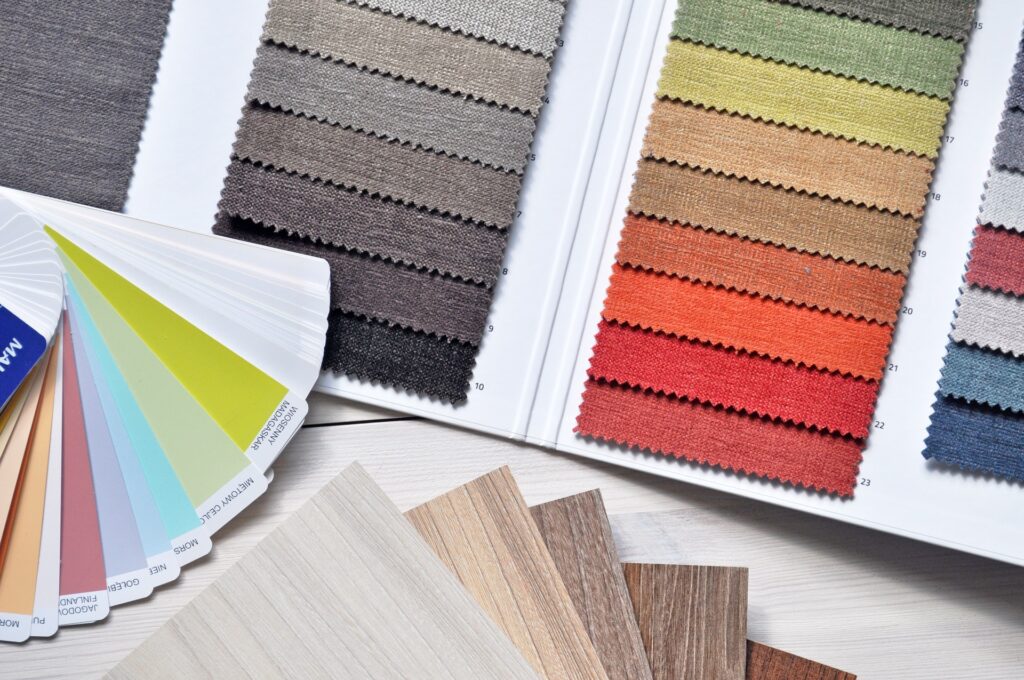
“Sometimes all you need is a change of palette! Yes, the palette can change the experience of your home in a big way!”
Choosing a suitable palette
How do most of us choose an interior palette?
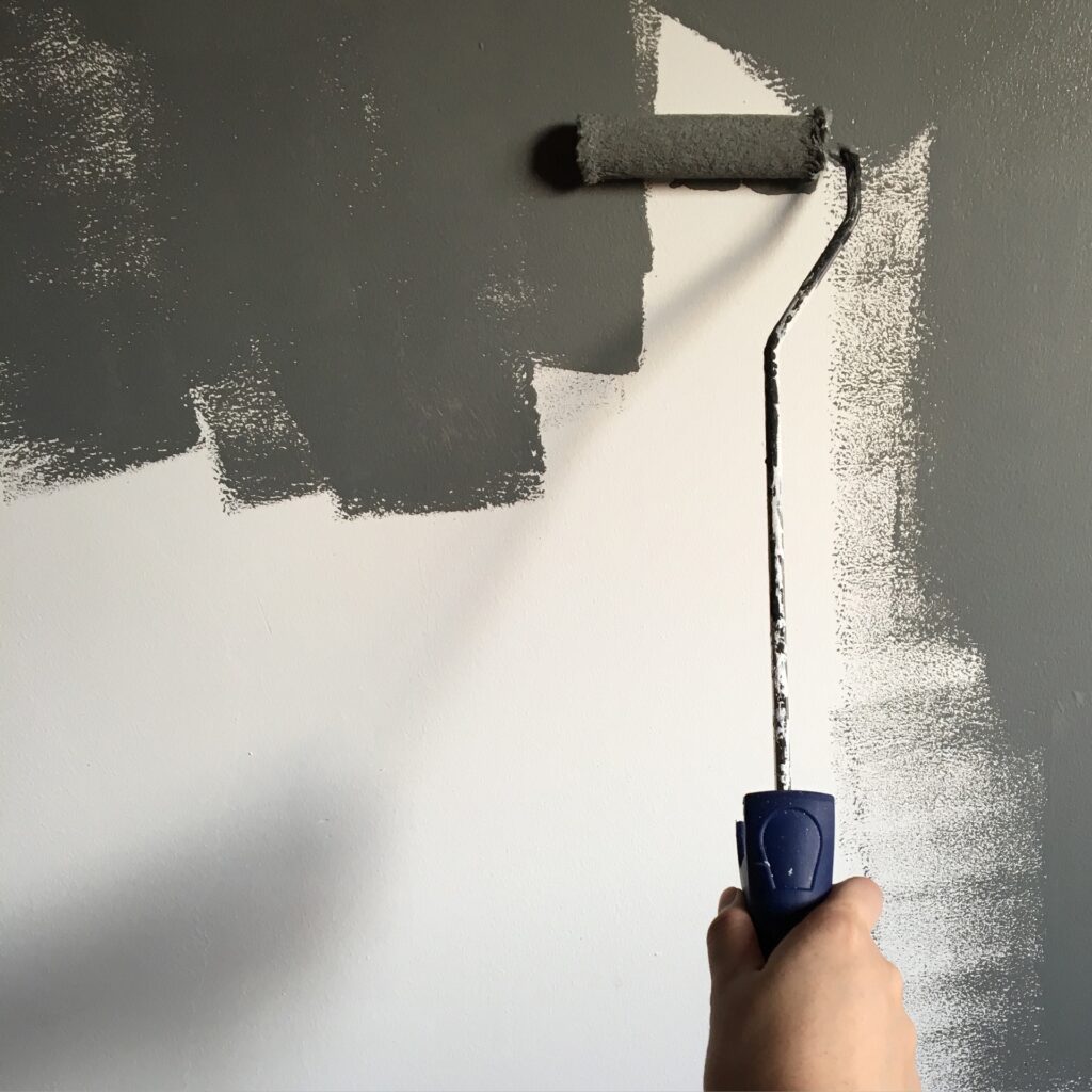
Most of us naturally play it safe when we choose the colour/material palette for our homes. We tend to take a more grounded approach and naturally gravitate towards neutral spectrums, as we all believe that it’s indeed the most flexible stage to set for any form of interior decor. In most schools of thought, it makes the room brighter and seem larger than it is.
But do “neutrals” perpetually have to conquer all in the interior design space?
Isn’t it high time we refreshed our mind frame?
Let’s study Karan’s choice of palette for the BLUE HOUSE, to understand how incorporating bold palettes can indeed devise a unique experience for each space
Before diving into the palette for each space, Karan Desai chose one colour that remained consistent throughout the entire project, essentially stitching the spaces into one design concept.
In this case, Karan’s choice of colour, teal blue resonates in every space with a hint of variations that define the overall character.
“Your next step could be to choose one key colour to work with. Make sure everyone in the household likes it too!”
The BLUE HOUSE tour
As you begin your tour, take note of how each space achieves a different character to suit the respective user. Although each space has a different purpose and function, they still unite together as one design concept, simply through colour! You could apply this into your scenario to help you narrow down on the style you want, QUICKLY!
ENTRY FOYER
This space shows us how colours can be used to set the stage for undiscovered spaces that are about to unfold
The entrance is essentially the space that sets the tone for the rest of the house.
Composition: A large double door entrance in teal spelling grandeur and luxury, hints at what a visitor might potentially expect when it opens. Open doors lead into a foyer that instils a sudden visual tease, sporting contrasting tones in the form of a blood-red glass console (inspired from the designs of GlasItalia) on which is perched a large meditative idol in bright white. The presence of a large idol at the entrance whispers that spirituality is indeed an important element in the family’s lifestyle. The colour of the door bleeds into the foyer to adhere to the key colour, seen on the metal floor-to-ceiling screens, that create an element of privacy from the rest of the house. The foyer was a new addition to the house to introduce a choreographed pattern of entry and experience.
The vibrant mix of colours in this space focuses on key elements to convey a certain message.
Character: Element of surprise, grandeur, welcome, privacy, contemporary, spiritual
LIVING ROOM
This space shows us how colours can be used to emphasize keyspaces from the rest
The living room is the space where a family’s personality ‘in unison’ comes to life and where their hospitality resonates. Space where conversations may discourse and precious family moments can unfold.
Composition: The original living space appeared lengthy as the adjoining dining and spill out balcony unfolded subsequently, creating a long compartment of sorts. Without the flexibility of creating wall barriers to emphasize the living space alone, a gradual change in colour tones became instrumental in achieving zones for function creating unique identity and character.
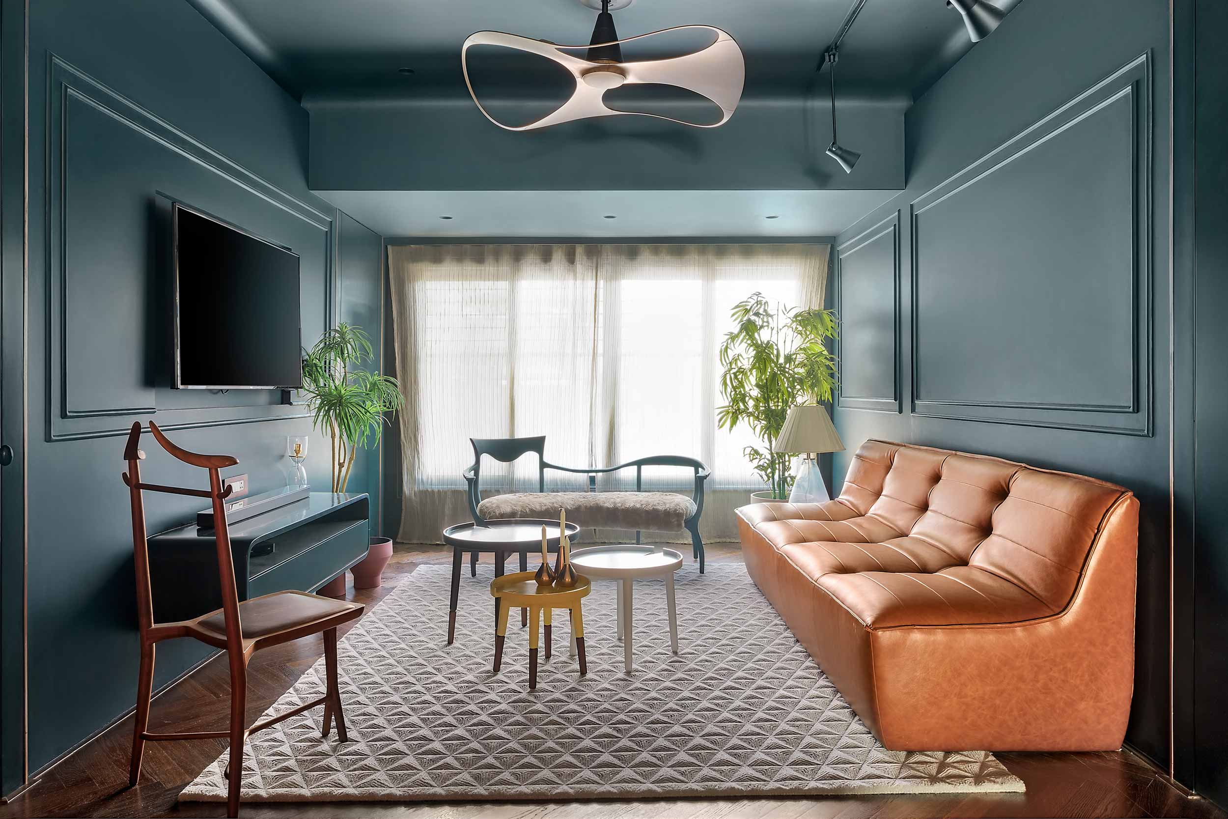
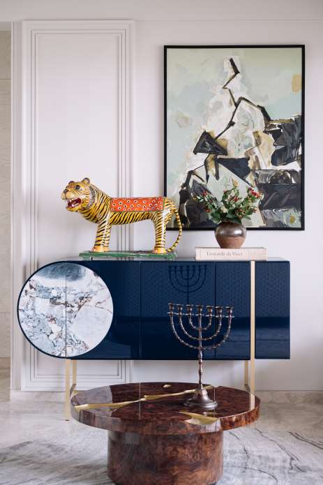
The living space sports a singular deep teal blue tone from wall to ceiling, bleeding onto a console and some of the furniture. Pattern and texture are introduced by highlighting this space with a herringbone HAVWOODS hardwood flooring. Adding further depth are classic wall mouldings that subconsciously frame a wall-mounted television or paintings. Copper is used as the transition material used in grooves, enhancing the space with a scintillating luxurious effect. Further uplifting the composition is unique statement furniture (inspired by one of the designer’s favourite brands – Ceccotti) that adhere to the palette of the space, with the addition of a brown accented synthetic leather sofa. A Karim Rashid fan adds to this definition of unique and different.
Neutrals take the back seat albeit adding a genteel feel in the form of delicate drapery and soft floor fabrics.
Character: Classic, monolithic, warmth, luxury, inviting, unique, different, bold, contemporary, important
DINING ROOM
This space shows us how colours can be used to highlight function
The dining room is a sacrosanct space that brings members of a family together momentarily during the day, to break bread and share individual news and insights.
Composition: The decor lays more emphasis on the function, toning down on the circumambient palette of the space. Sporting subtle nude painted walls with classic moulding, neutral coloured tiled flooring, a large custom-designed 6 seater dining table in 7” thick white marble, and whispers of synthetic leather accents seen in the custom-designed chairs (inspired by the mademoiselle chairs by Kartell) and blue island counter. This strategic toning down lays more emphasis on family gatherings and especially offerings awaiting them at the dining table.
Character: classic, function-oriented, sacrosanct, minimalistic, contemporary
KITCHEN
This space shows us how colours can tie different spaces together into one entity
The kitchen is the heart of the home and the process of meal preparation is always brought to the fore.
Composition: The kitchen is opened up to naturally spill into the dining space. Like the dining area, the kitchen too tones down to bring the sanctity and process of meal preparation into the spotlight, essentially tying the two spaces through the choice of palette. Higher activity spaces in the kitchen, tone down to neutrals sporting bright quartz countertops from Quantra and white overhead cabinetry, bringing the vibrance of kitchen ingredients to the fore. Accents are politely introduced into the picture seen in the blue open grain veneer cabinetry below the kitchen counter.
Character: function-oriented, minimalistic, contemporary
BED & BATH
These spaces show us how colours can speak volumes of the individual user’s personalities
These spaces define a person’s privacy and are where they part ways from the rest of the family. Although these spaces may be dividing in nature, they are also sanctuaries, places to zone out, veritable batteries to recharge and comfort zones.
Composition: The three individual bedrooms with respective adjoining bathrooms in the house showcase different compositions for each of its users.
The toned-down guest bedroom which is mainly occupied by the elderly of the family, sports subtly toned off-white painted walls with accents seen in the timber flooring. Giving a classic, matured, less experimental look to the space. Its adjoining bathroom which also translates into a guest powder room manifests hints of the overall theme of the intervention, where the bottom half of the bathroom is adorned in classic white tile and fixtures, whilst the upper half hints at a dull less vibrant teal blue.
The children’s bedroom and adjoining study manifest a colourful palette to embrace what childhood is all about, freedom. Vibrantly coloured-coded bunk beds, his and hers, occupy the bedroom. A child-friendly palette in a mix of colourful neutral pastels used across the walls and flooring of the study encourages the freedom to draw without having to worry about the aftermath, courtesy of the chalk series tiles by Marca Corona. This core material that defines freedom in the bedroom trickles into the composition of the bath as well. The glass partition of the shower area adds a touch of vibrance, covered in brightly coloured films on each glass pane.
The master bedroom spells luxury and grandeur in its composition. This is where colour conquers again covering the entire room in deep teal concluding with the softness of carpeted floors in taupe. The grand and contemporary silhouette of the four-poster bed frame, the classic bedside wall mounted ambient light fixtures and minimalist modern bedside tables create a coherent fusion of styles that surprisingly sit well together. The monolithic appearance of the bedroom in teal takes a slight diversion into a nude coloured reading area occupied by a classic armchair in deep teal. The adjoining bath creates a visual tease with a sudden and very contrasting introduction of white. Finished delicately with finely veined natural marble across the walls and flooring, a high-end bath, vanity and WC fixtures, the bathroom emulates the sense of luxury of the bedroom, sans the warmth of the deep teal.
Character:
Guest bed & bath – classic, mature, less-experimental, simple
Children’s bed & bath – vibrant, flexible, child-friendly, vivacious
Master bed and bath – contemporary, bold, luxurious, classic, warm & cool
PRAYER ROOM
This space shows us that colours can be used to create an element of visual focus
The prayer room is the main sanctuary, a place to worship to meditate and for reflection
Composition: The rectangular and long space emphasizes religious pictures and figures at one end of the room. Although the room appears to be bright because of the walls clad with white marble, the accented deep teal ceiling and brown hardwood floors help to create a sense of focus towards the far end of the room. The temple was a new addition to the layout, consuming floor space from the guest bedroom to accommodate the family’s requirement and emphasis on their spirituality.
Character: bright, grand, warm & cool
A better perspective?
From the above case of the Blue house, we can understand how the colour palette can indeed be used to our advantage to instil the quality of experience we wish to convey. It goes to show how versatile and instrumental colour can be in a design intervention to instil a plethora of characters to spaces.
Now that you embark on a journey of revamping your own spaces for a fresher more chic look, consider this contemporary example and wash your fears aside.
Be bold, add a bit of vibrance into your life and indeed embrace colour like never before!
Hope this feature helped accelerate the interior design process for your home
If you have considered a different approach, we would love to know more about it!
Discover similar articles

How To Apply The ‘Nudge Theory’ For A Better Lifestyle
First Look! Experience Upscale Living at the New Quincy House Singapore in Holland Village
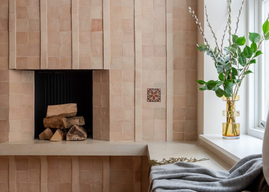
Historic Factory to Contemporary Living: Palladian’s Innovative Renovation of The Tile House

Amazon Prime Day 2024: Your Guide to the Ultimate Home & Decor Savings
The Ultimate Guide to the Best Home Decor & Furniture in Singapore
11 Tips and Tricks: How To Master the Art of Shelf Styling
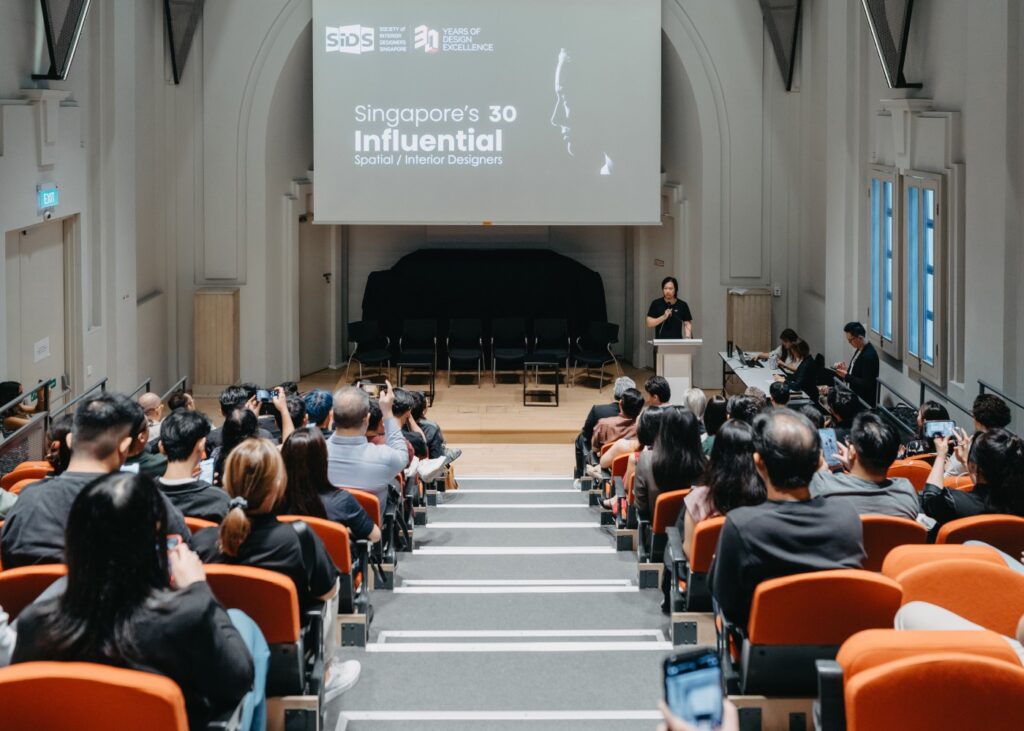
Designing the Future: SIDS Marks 30 Years with Exciting Anniversary Campaign
7 Best Interior Design Trends We Love: Trendspotting 2024
The design of luxury living in Nad Al Sheba, Dubai
JS Residence, a modernist home in a neutral palette

Airavaat, a home in the clouds

Apartment interiors: Elegance in simple tones & textures
An idyllic holiday home nestled in a coffee estate

Apartment Interior Design: Inspired by the great outdoors
Nestled in a Contemporary & Classy apartment
Copyright © 2026 DSGN arcHive

