Unveiling the Design Secrets of F1 Paddock Club Singapore
Published on October 30, 2024 | by DSGN arcHive
We chat with the visionaries who brought this project to life, revealing the sophisticated design algorithm that sets it apart in style and innovation.
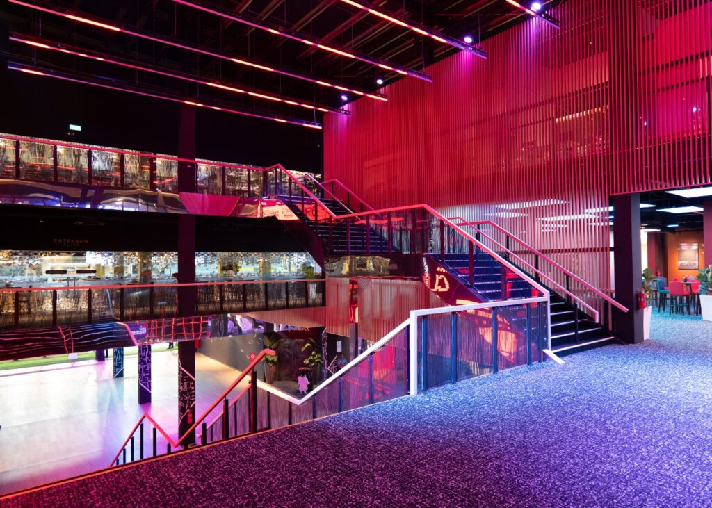
How do you take an F1 race and translate it into the language of design? The award-winning F1 Paddock Club Singapore 2023 offers a stunning answer. Crafted by DP Design and led by IDr. Thea Teo, this venue channels the energy of the racetrack into every detail, with its concept, the “Circuit Design Language.” Sitting down with Thea, we uncovered the intricate thought behind each design element, from the curvature of the spaces to the sustainable use of materials, all carefully planned to create a sense of movement and luxury. Celebrated at the Singapore Good Design Awards 2024, the Paddock Club blends eco-consciousness with high style, inviting guests to experience the race with unparalleled intimacy.
F1 Paddock Club Singapore
1. Could you explain the Circuit Design Language and how this concept was incorporated into the overall design of the F1 Paddock Club Singapore?
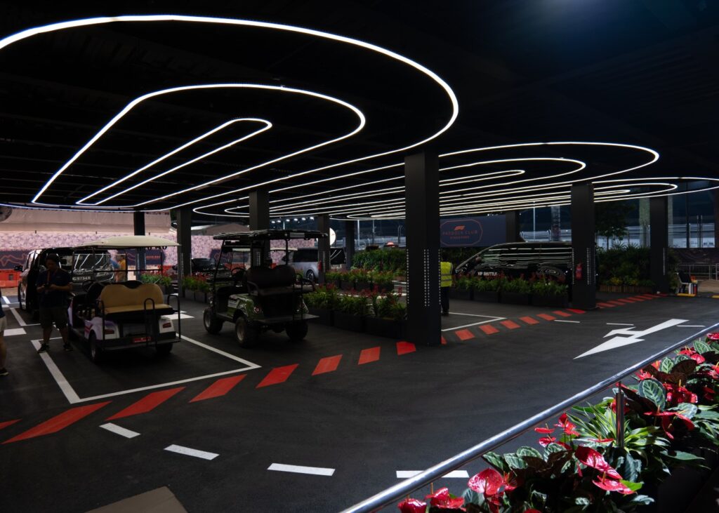
The Circuit Design Language concept was driven by the topography of the F1 circuit. Mimicking the race circuit, they were iterated as sleek curves and edges, and applied across the main spaces in Paddock Club. For example, at the drop-off lobby, the lighting on the ceilings were designed to give the impression of ‘overhead’ driving experience as you walked about the spaces. Their colour and brightness were intentionally matched to the colours of the Singapore roads. This arrival point allowed the VIPs to be greeted into the main entrance of the Paddock Club.
Circuit-inspired ceilings and lighting
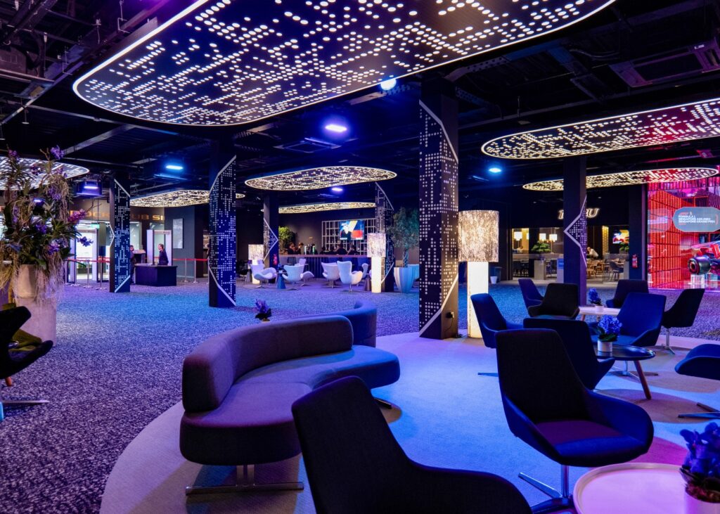
In the main lobby, the ceilings here convert into filled graphics while retaining the rounded curves as a base to the overall design. Randomised dots in the graphics gave the space some texture and variation. This idea was also applied to the columns, with an added feature of triangle/arrow-looking effect, which is mimicked the curve markers from a driver’s point-of-view.
With the main atrium, we really wanted to build up the sense of anticipation and excitement. Key to this was creating a clear line of sight across the 3-storey high LED screen and 3-storey void that overlooks the atrium and main stairway with the sleek straight lightings on the third level visible from the first level, and in-line with a feature that would appear on the LED screen. The colours of the lightings varied according to the visuals presented on the LED screen and the music. A life-size F1 racing car set against this backdrop, greeted visitors as they entered, adding to the sense of spectacle.
The Vibe
As the F1 race in Singapore is a night race, the overall vibe and expression we carried forth from the drop-off lobby to the atrium accentuated ‘nightlife atmosphere’. Visitors experienced ‘overhead’ driving while walking through the designs of the spaces as mentioned earlier.
2. Can you elaborate on how strategic spatial planning and material choices enhance comfort in areas like the L2 Courtyard and L3 Roof Terrace?
The L2 Courtyard serves as a forecourt. It is a mid-landing that welcomes visitors coming up/going down from the main staircase, and a space that transits into the various restaurants and suite. As there is a bar right at the center facing the main staircase, spatial planning was important so as to not block the views between the two spaces. The main pathway remained clear while providing enough seats for visitors who are drinking at the bar area.
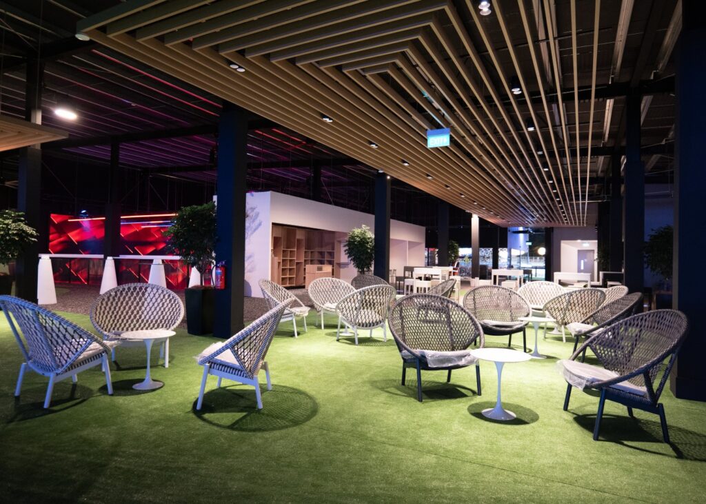
The L3 Roof Terrace is a shared area between the interior and exterior space that overlooks the night race. Furniture chosen for this area were more lounge-type but well-matched to the exterior furniture made out of sustainable PE rattan. To ensure coziness, the seating arrangements were gathered in pockets of spaces, allowing visitors to gather and mingle in smaller zones. The bar counters were strategically placed along the borders of the interior spaces so as to not disrupt traffic flow.
Different material choices were made for both areas to lend each one their own spatial identities. L2 courtyard used darker tones for the counters and furniture and played with LED screens for the ceiling, so as to tie in with the digital aspect from the main atrium. L3 Roof Terrace featured brighter tones, woody textures, tropical wallpapers and a higher ceiling to allow visitors to immerse themselves into a ‘nature’ theme.
3. How were intimate spaces like the Paradiso Bespoke Bar and Suites designed to offer exclusivity and create a unique atmosphere?
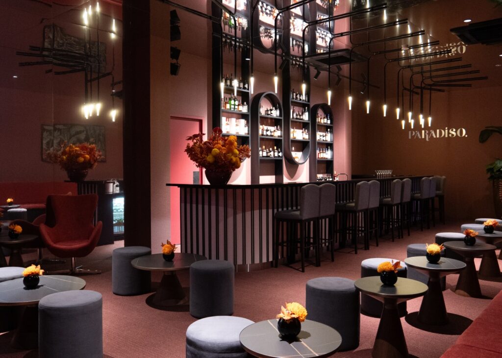
With Paradiso Bar, we played to its spatial limitations; it is smaller than the other areas in Paddock Club and has a narrow walking space. The idea was to juxtapose an intimate setting with a really bold aesthetic that would translate to the sense of a limited-edition space and experience – i.e. exclusivity. The overall colours of the bar are in red and dark pink hues, and we applied a mirror laminate across the entire ceiling. The result emphasized closeness without highlighting tightness of the space, while delivering a truly unique atmosphere.
The Paterson and Claymore Suites, on the contrary, are big in terms of area. Here, with careful spatial planning, we created exclusivity through a heightened sense of privacy without compromising on wide walking spaces for visitors and operations. This is especially so in the VIP zone and a loft area in the Paterson Suite, where we added foliage, giving more privacy to the VIP patrons sitting inside. Patrons of the suites have first access to the standing viewing deck right above the race track as well. Not to mention, the patrons who have a ticket to these suites are treated with great hospitality from the client team.
4. What is the significance of the five renowned restaurants, such as Nobu and Dani Garcia, and how are their designs tailored to reflect their culinary identities?
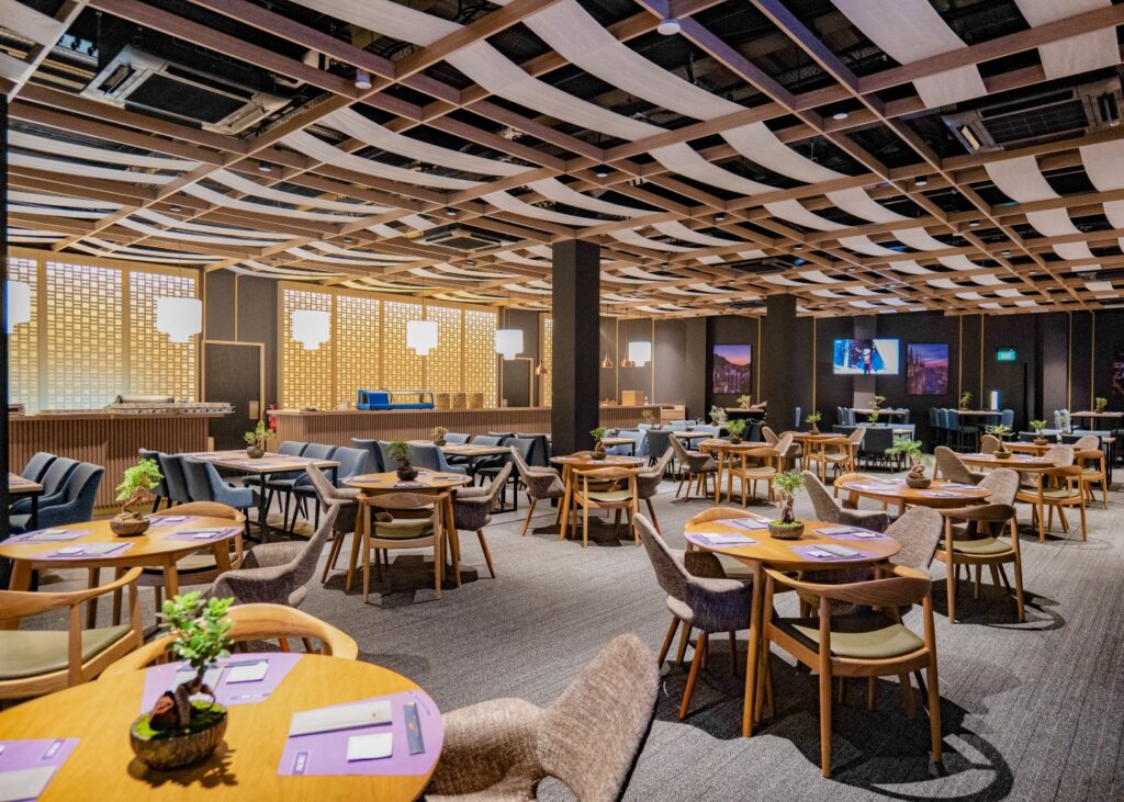
Every year, our client invites renowned Michelin-star restaurants to be a part of the Paddock Club. The main chefs, who are owners of these restaurants, will come down to be a part of this big event and to serve patrons delicious food. It not only adds to the sense of the F1 races being a star-studded event but also elevates the sense of exclusivity when one experiences F1 from Paddock Club.
The design approach for the restaurants was not just about visual access to the race. It was also about contextualizing the cuisines and their origins. For example, Nobu serves Japanese cuisine, and in each of their restaurants worldwide, the interior designs include some Japanese-themed elements like timber slats mixed with minimalistic and neat looks for their sashimi counters.
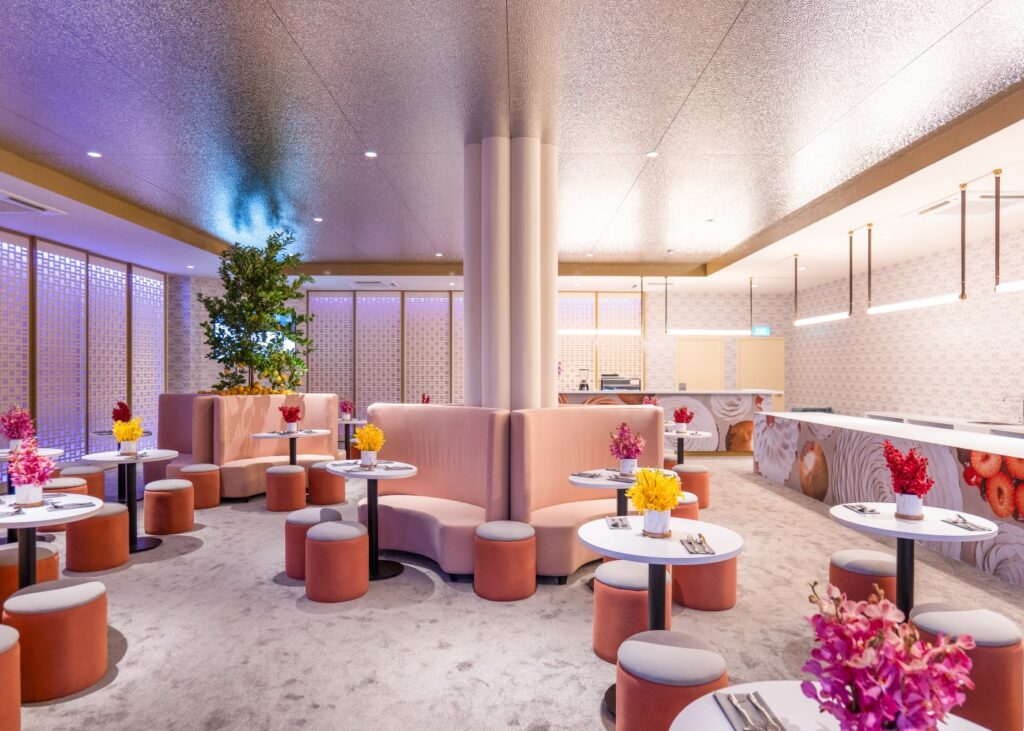
Most interesting for us, was the interior design for Cedric Grolet, the desert bar. The brief called for all counter-tops to be kept clean and white so as to showcase their signature pastries, dessert, coffees and teas; which led us to explore iterating design elements on the walls and ceiling. Pop of colours were also chosen to bring out some familiarity to the branding, in relation to their original restaurant in France. When we spoke to Clare Smyth, the chef and owner of her own brand, she mentioned that the design was similar yet different but comfortable to work in and overall satisfied, this assured us that we have achieved what was needed for the branding and culinary identities.
5. How does the Circuit Design Language integrate sustainability and innovation, and what future design trends do you foresee influencing this approach?
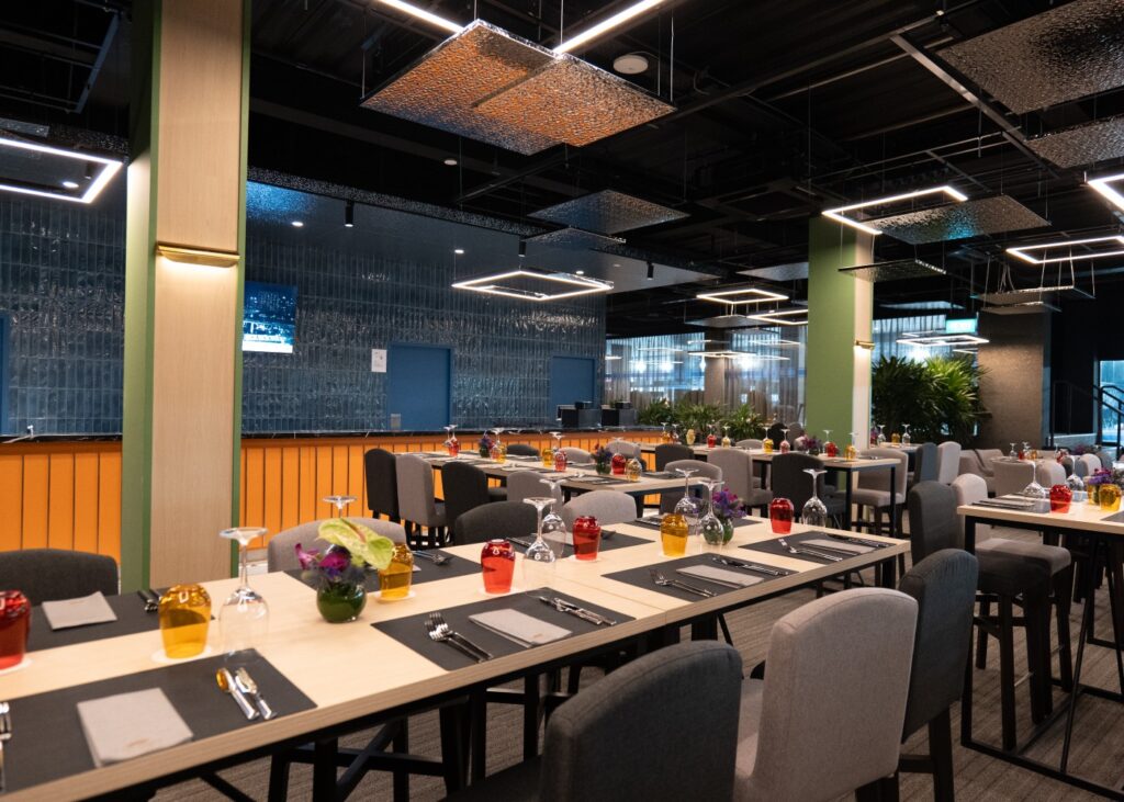
Sustainability and bespoke are two terms that have way more common ground than first meets the eye. As consumers grow in awareness of carbon emissions generated from mass production and material waste, we’ve witnessed an increase in demand for re-purposing materials. Some of the best designs out there are realized with vintage textiles and fabrics, creatively contemporized to deliver high value bespoke designs.
In the same vein, our design scheme for F1 Paddock Club 2023 was realized through the re-using of as much of the previous years’ materials as we could. Such items include the flooring, counters, wall panels, lighting and even furniture – of which were re-upholstered and re-laminated where applicable. And to ensure that the circularity of design and materials are upheld, our design scheme was formulated with a plug-and-play system, which enables most of the elements to be re-used and/or re-purposed in different variations in the subsequent years of F1.
We want to remind people that good design does not need to come from expensive materials, but rather to look at what materials can be recycled or improved.
Thank you, IDr. Thea Teo, for sharing these invaluable insights about the project. Have you had the chance to experience the F1 Paddock Club Singapore? We’d love to hear more about your impressions and what stood out to you during your visit—feel free to drop us a DM at archivedsgn@gmail.com
If you’re a designer with a standout project ready to make its mark, now’s your chance! Enter the SG Good Design Awards and let your work shine in the spotlight—click the link to find out more!
Wondering what we’re up to next?
Give us a follow and stay in the loop!
About DSGN arcHive
DSGN arcHive is your exclusive key to unveiling the enigmatic essence of a city, all filtered through the prism of design. Far from the ordinary tourist paths. We reveal the city’s architectural marvels, urban intricacies, cultural tapestry, and eco-conscious revolutions that mold its distinctive soul. With us, you’re invited to savor the metropolis in an entirely chic and sophisticated light, a city that’s far more than what meets the eye.
What's New
Copyright © 2025 DSGN arcHive
