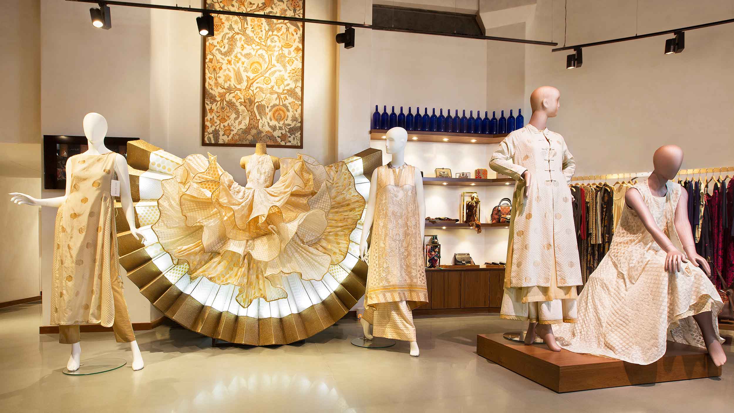
'A STITCH IN TIME'
Historical artefacts are an important construct to honest testaments of the past that once were. They enable us to revisit a defining moment in time, that either was a celebration of laurels or a disintegration in defeat. These artefacts appear so artfully static in their current bare appeal, secured within illuminated museum displays. Evoking an emotional experience in their spectators as they stare back, oblivious of their rich past.
There is one particular form of artefact that may emerge across museum archives all across the world. Its significance marks a traditional and cultural legacy of one country and its people, marking a golden era in trade. This artefact, namely the Indian textile, was all the rage for more than 2000 years, used for extravagant interior decor, haute couture mongst the affluent of Europe. Its artistic manifestations captivated the world in their sheer extravagance and craftsmanship. They included fiber, fabric, and patterning technique, an exhibit of magnificent woven, embroidered, and resist-patterned textiles, cloth painted or printed with dyes and pigments.
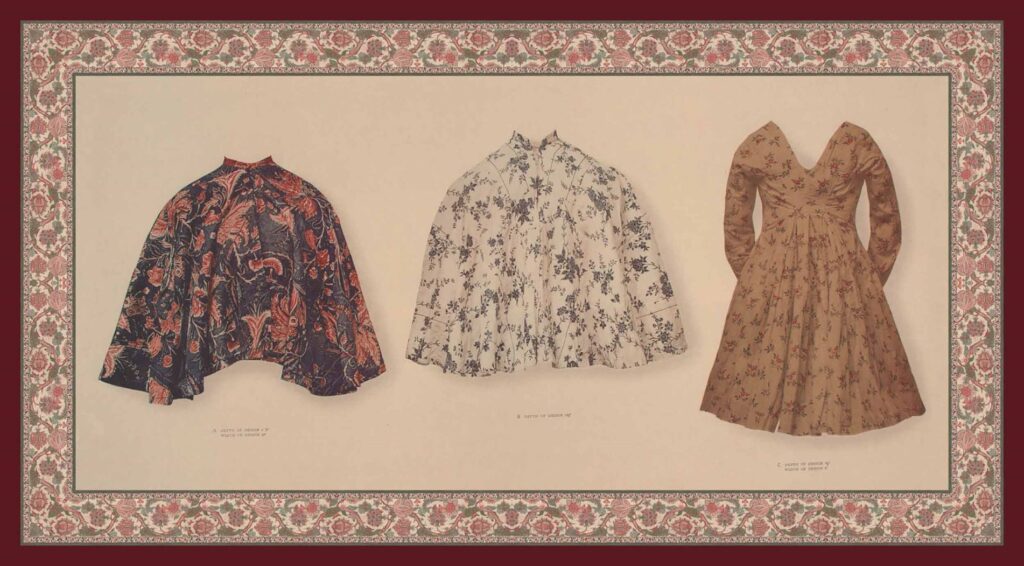
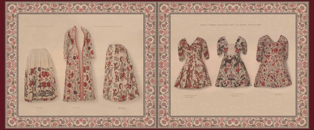
Within a sudden stronghold of a 150 year long “colonial freeze”, these timeless textiles from this once thriving populus, travelled the waters but lost its identity, as did its craftsmanship. Until a young fashion designer arrived onto the scene in the 1960s and recognised a lost craft that had vanished in just a nuance of the country’s age old history. Her brand recognised the history behind the hybrid craftsmanship in fabricating handmade textiles, in the midst of a machine mass producing era. She put in enormous efforts to design and recreate 17th century prints that were traded and are displayed in museums all across the world, going through a tedious process of restoration via digital renderings. Her sweat and toil in this exercise was to accomplish one vision, to bring back a lost craft to its indegenious people; and to especially shed some awareness on its patriotic significance as India’s rich repertoire of textile design.
She started to then incorporate Indian traditional textiles and Chintz into contemporary recognisable silhouettes. This became a global phenomenon and indeed set the stage for futuristic designers to shed new light onto old heritage vocabulary in the fashion and textile industries. Her first boutique opened in the year of 1966 and has been the rage across the fashion industry ever since. Her greatest most commendable achievement has been providing employment to many artisans and reviving several ancient crafts within the handmade textile artistry.
Today she is called the ‘Pioneer of Indian Fashion’ for her remarkable contributions to the fashion industry. She is the recipient of two very prestigious National awards namely the ‘Padma Shree’ by the country of India, and the ‘Chevalier des Arts et des Lettres’ bestowed by the French government. I am speaking about the ‘first lady of Indian fashion’, the one and only, Ritu Kumar.
Ritu Kumar as a brand name has indeed scaled to every nook and cranny of the Indian subcontinent. Her fashion has a broad reach of international customers as well, yearning to own a piece of her style in their wardrobes. To do justice to her extravagant ensembles, she also lays great emphasis on an impeccable presentation style, to preach her fashion statement to the masses. One can experientially immerse themselves with her masterpieces at any of her uniquely designed Retail setups across India.
The Ritu Kumar ‘Retail space’ design, renders the ideals of the visionary, setting a timeless statement in line with her fashion. Her stores are a beautiful patronage to the rich heritage of the country. An important reminder of one of the oldest cultural legacies of human history, that was once nearly lost.
In collaboration with ‘Studio Pomegranate’, her vision for her retail spaces came to a successful fruition in India’s entertainment capital of Mumbai.
CREATIVES CONVERGE
Studio Pomegranate was established in 2013 by two Architects, Shweta Chhatpar and Pranav Naik. Having secured specialisations from internationally renowned design schools, the two creatives got together to create a stunning, historically oriented narrative to showcase legendary Ritu Kumar’s fashion statement. Earning her greater attention with their first successful interpretation of her retail space at her flagship store, Kala Ghoda. Subsequently they were blessed with three noteworthy property spaces to render the ‘historically immersive’ design language, located at Palladium, Juhu and Kemps Corner.
The studio schematically approaches most of their projects by laying great emphasis on sustainable design and environmental appropriateness. The premise upon which a superseding design intervention is then explored, adapted and eventually implemented. Their approach towards Ritu Kumar’s stores rendered the very same ideals, paying close attention to each of the properties inherent attributes before arriving at a scheme. Each design intervention is a beautiful congregation of Ritu Kumar’s signature style of fashion-presentation and Studio Pomegranate’s attempt to revive the architectural heritage of Bombay through an enticingly woven narrative.
THE 'RITU KUMAR' RETAIL SIGNATURE
Across the four Retail space schemes, the design team envisioned a platform that would especially elevate the vibrance of the garments, pitching them in the forefront of their spatial compositions. Whilst the circumambient spaces would attempt to vanish behind the scenes in a respectful or courteous manner. Although in some spaces the background appears opulently draped in richly patterned fabrics, painting quite the regal picture.
Key design elements define the signature canvas for all the retail spaces, that truly highlights the essence in the Ritu Kumar trademark:-
The signature outline conceives a veritable gallery-like appeal sporting bright and spacious garment display spaces, finished with a tasteful neutral palette of white and shades of pale green and grey. Rendering easy pedestrian circulation and product visibility.
Walls are finished with texture paint and adorn round edges across all retail stores, hinting at the quaint 1920s Mumbai Architecture.
The flooring is an extensive showcase of pale green polished kota, carefully quarried to 4’x4’ dimension conserving a singular colour tone across the floor space. Some spaces may be introduced with a different flooring material like teak wood, and come in contact with the kota floorspace via a brass junction. The floors and walls create the most tasteful minimalist background canvas.
The garment display is a vibrant exposition of garments that appear to levitate across the floor area, supported via brass box or cylindrical section systems that are ceiling hung. Adding a scintillating dazzle to the Ritu Kumar presentation. This arrangement creates quite a theatrical showcase and caters unchallenging vantages of the garments along the circulation spaces.
The extensive lighting concept that illuminates the entire gallery manifests suspended track lighting resonating the shape of the floor space amid levitation. Establishing perfect visibility and illumination to each of Ritu Kumar’s designer garments.
The ceilings and billing desks across all projects are uniquely designed based on the context of each property.
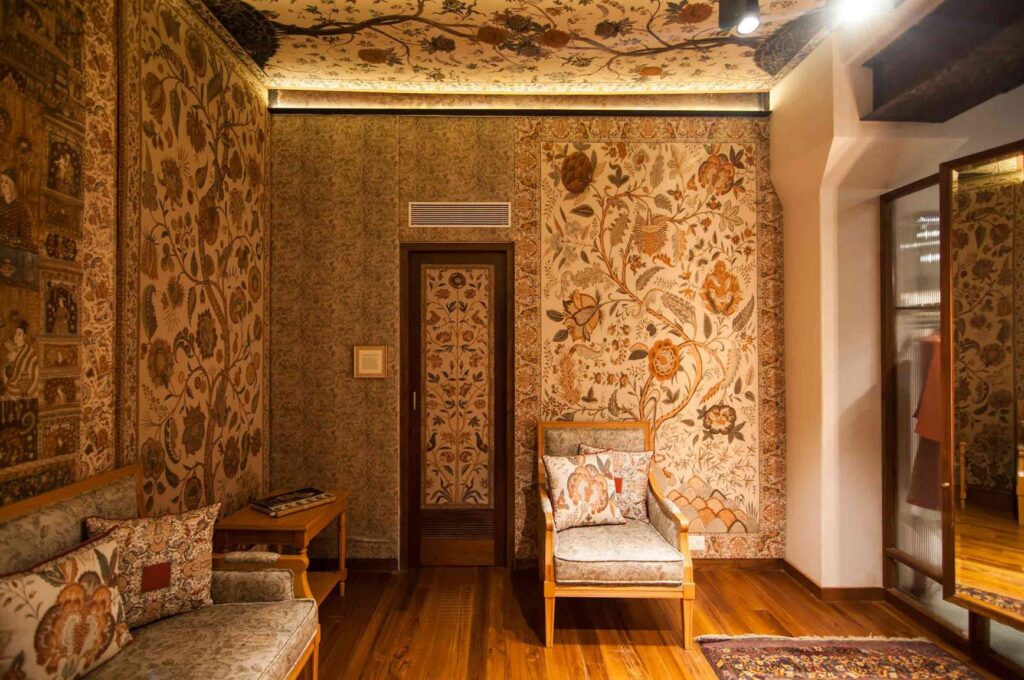
The primary display area spills delicately into a Bridal suite and a Vanity. These spaces are especially dressed with redesigned replicas of 17th century Indian Palampores all across its walls and ceilings. This experientially creates a magnificent climax to the circumambient interiors as a whole, celebrating the sophistication of Indian pattern making and Chintz.
The Vanity is the centrepiece of the bridal salon, sporting a 3 fold origami like system of brass/wood framed panels that is wall mounted and illuminated at its folds. Framing a breathtaking reflection of a classic Ritu Kumar ensemble each time it is visited, finished with the most opulent encompassing background.
The Palampore patterns manifest prints that were once a highlight in bourgeois’ abodes. The selected prints revived by Ritu Kumar include, “Tree of life” motifs, two court scenes and dance scenes from the Deccan. All four stores don an eclectic composition of all these contrasting prints, that surprisingly sit together monolithically in an atypical harmony. This is by far the most prominent design element seen across most stores, setting a fresh and contemporary edge that is indeed unique to the Ritu Kumar ensemble.
Her choice of putting an extensive spotlight on Palampores, is to restore a time in history by bringing about an awareness of the sophistication in craftsmanship by the Kalamkari craftsperson. It also hints at a rich textile trade with the East India Company. Rendering a quaint reminiscence of the most glorious schools of textile fabrication, celebrating the humility and sophistication of the Indian painter and vegetable dyer.
This composition of elements forms the base canvas rendered at all the retail stores. They were subsequently built upon with differential manifestations with respect to their pre-existing contexts.
DIFFERENT CONTEXTS
The signature retail canvas was rendered in all 4 projects maintaining a singular design statement across Mumbai. However each of the properties posed a differential set of attributes that were embraced and dealt with in the most professional way by Studio Pomegranate. Their individual attributes mentioned below, state their uniqueness from each other.
Ritu Kumar, Palladium
Located in a spacious, non rectilinear shaped floor area, with a small frontage on the 3rd floor of Palladium mall, Mumbai.
Project area: 2100 sqft
The design team includes Pranav Naik, Shweta Shah, Arjun Pathak, Kishor Ayre
The design concept is a visual depiction of a typical twilight evening in Mumbai city. The dark sky showcases the sun’s dramatic departure with a scintillating choreography of golden clouds. This effect is contained within the confines of the retail space, which also reflects upon the former mill buildings that occupied the lands of the mall. Historically weaving the spatial arrangement within the local context.
The lighting is a theatrical sashay of golden illuminated mesh clouds suspended via cables, against a black sky ceiling. The mesh is given a shimmering effect with hidden lighting that highlights a magnificent play of sheer light and shadow.
The bridal area exhibits the ‘tree of life’ pattern which was used as a premise for the composition of scintillating clouds levitating from the ceiling.
Ritu Kumar, Kemps Corner
Located on the ground floor level of Kwality house, had been occupied for decades prior to this intervention. Several layers of building material had stacked up onto the original true structure. The design team worked tirelessly at carefully peeling off the years, layer by layer, revealing the original beauty of the structure. It revealed a larger floor height, beautiful jack-arch floors, two solid iron columns and three large display windows.
Project area: 2000 sq ft
The design team includes Rasika Rajagopalan, Shweta Chhatpar, Pranav Naik, Tulika Shrivastava, Shashi Kumar
The design concept portrays the essence of the original structure that was concealed for years. It was translated into an aesthetic stage, showcasing its history, in a new and contemporary light.
The layout is divided equally by arches, into three sections visible externally through the 3 display windows. The entrance opens onto the central space where the billing desk is located in between two large columns. This space is flanked on either side by garment display areas that spill into a bridal suite and changing rooms.
The ceiling is painted in textured taupe highlighting the beautiful jack-arch features.
The bridal suite is a genteel canvas of soft pink textured walls and Palampores set into its wall niches.
The billing desk is a monolithic desk finished with kotah and marble slab countertops. The space is accentuated from the rest of the store with a deep red textured backdrop.
Ritu Kumar, Kalaghoda
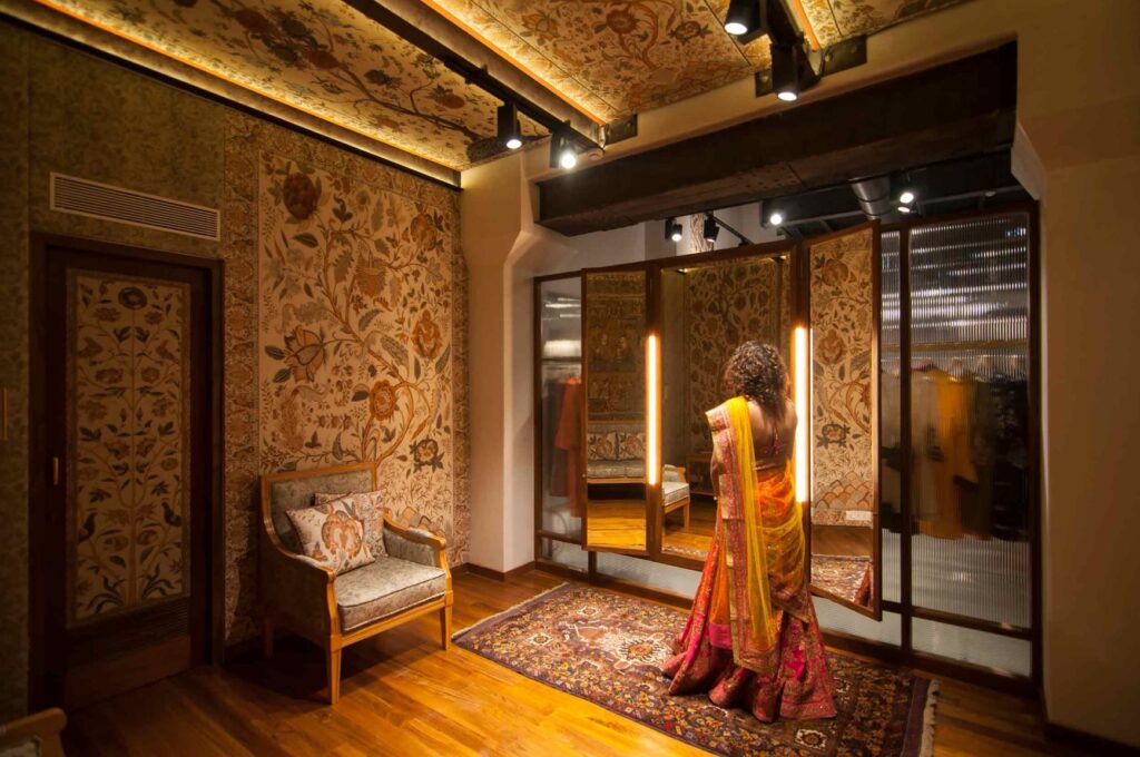
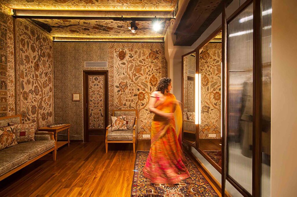
Located on the ground floor of an old heritage building called Ador House, Kala Ghoda, Mumbai. The building was restored internally and externally to celebrate some of its key inherent attributes. For example, its ceilings showcase pre-independence steel girders which were garnet-blasted to restore their original color, and finished with a clear coat to seal their surfaces. Other elements such as rounded plaster walls, timber framed fenestrations, the solid green limestone plinth were restored and retained.
Project area: 2400 S.ft.
The design team includes Pranav Naik, Shweta Shah, Pokar Ram Jasol, Imran Ali, Rameshwar, Moeen Shirazi, Sanjana Sidhra, Nikita Shahdadpuri
The design concept conceives an extensive restoration exercise of Architecture and Fashion, all under one single roof. This was achieved by restoring the inherent spirit of the heritage building, and converging the visions of Ritu Kumar to revive the rage of Palampores or Kalamkaris into a contemporary retail setup.
The layout showcases the largest Ritu Kumar retail space in the city, sporting an open floor layout that is virtually subdivided by garment display racks. The primary display space is separated from the bridal salon via a large vanity.
The material palette introduces warm teak wood textures
The garment display exhibits slender brass cylindrical sections of wall and floor mounted systems used to hang garments. As opposed to the other stores where the systems are ceiling hung.
Ritu Kumar, Juhu
Located on the ground floor, facing the Juhu Tara road, which is in close proximity to the beach. Refreshing landscape features were introduced at the property’s entrance portico to instil a grand welcome.
Project area: 800 Sq.ft
The design team includes Shweta Chhatpar Shah, Pranav Naik, Rasika Rajagopalan, Neel Davda, Yashasvi Adamane, Ashraf Khan
The design concept references with the local encompassing context of the property location, resonating a casual coastal vibe. It attempts to unite the outdoors with the indoors via an extensively glazed facade shell that dissolves into the setting, being one with the design.
The layout is conceived within a rectangular outline that is subdivided longitudinally into two sections by the entrance foyer. The entrance space is spatially reduced by the presence of a changing room. It is flanked on either side by garment display space; with a billing counter, toilet and store on one side. The open floor space is further subdivided by winding garment racks that loop all along the length of the store. The rectangular layout is juxtaposed by an enclosed landscaped entrade that instils a refreshing welcome to its patrons.
The color palette inclines towards darker hues sporting black painted ceilings
The billing desk is set into a wall recess-like space, flanked on either side by a store room and toilet. Externally the desk is finished with marble slabs, that are in sync with the marble finished entrance doors of the adjoining rooms. The doors and counter marble slabs together appear to highlight the billing counter into one monolithic frame.
DRAPED IN HISTORY
The Ritu Kumar retail trademark is a collaborative congregation of the finest disciplines of the arts; fashion and architecture. An undertaking that aesthetically wove back a tremendous patriotic sense of identity and occupation into a formerly colonized and subdued Indian geography. This incredible epiphany that is nurturing of heritage artforms into a freshly sewn and built tapestry of silhouettes, shapes a proud legacy for its indigenous people.
To experience this mould-breaking convergence of two harmoniously united disciplines under the same umbrella, one can pay a visit to any of these stunning stores in the city of Mumbai. Brace yourself to get immersed, be inspired, get seamlessly transported to another place in time, sense a patriotism that is beyond imagining, be part of a poetry that is indeed definitive of a powerfully rich Indian legacy that will never be lost, EVER AGAIN!

