Contact us
For any inquiries please email
archivedsgn@gmail.com
share
Copyright © 2026 DSGN arcHive
Project Name: TIMBER RHYME
Project location: Chandigarh, India
Architecture Firm: Studio Ardete
Gross Built Area: 134 SQM
Lead Architects: Ar.Badrinath Kaleru and Ar.Prerna Kaleru
Design Team: Badrinath Kaleru, Prerna Kaleru, Nisha Singh Sarao, Palak Puri, Abhimanue Sharma
Client: Bansal Ply Chandigarh
Photography credits: Ar.Purnesh Dev Nikhanj
Consultants: Electrical Lighting – The Luminars
Materials: Plywood – Kitply; Veneer – Turakhias Natural veneer; Paints – Asian Paints; Adhesives -3M; Lighting –Osram; Tiles – Simpolo
Product marketing showrooms are a pinnacle platform for the best advertisement of a product. Setting the right stage with key magnetic derivatives from a commercial viewpoint is crucial to capture a large lucrative catchment. Although the concept of advertising might be straightforward, the science and methodology used to draw more eyeballs within a fleeting moment in time to nurture interest, is a complex one. A design is best derived from the way it commands a captivating ‘first impression’, tames the psychology of human behavior with respect to spatial arrangement to kindle action, instills a sense of curiosity to further comprehend a protagonist product, and nurtures human curiosity towards purchase.
The ‘cycle’ of product experience is indeed key
One such stage set in the midst of a commercial hub in Chandigarh, India, shines a unique spotlight on the commodity it is designed to market. Unlike most platforms, ‘Timber Rhyme’ as it is called, is an exploration that utilizes functional artform to convey a captivating message to its audience. The intervention delves deeper into the traditional, historical and technological potentials of its product. As its name suggests, its exploration is everything and beyond in the artistry of timber crafting.
Timber Rhyme manifests a unique choreography of conquest, fluidity, sensuality, movement; conquering a singular space in the most genteel yet awe-inspiring fashion. Although the nature of the space itself is container-like, the statement is conceived by a large ribbon that enigmatically floats across the room, in a levitating movement, like with a breeze. What is most remarkable about this conception is that the ribbon is completely constructed out of one material,
Timber!
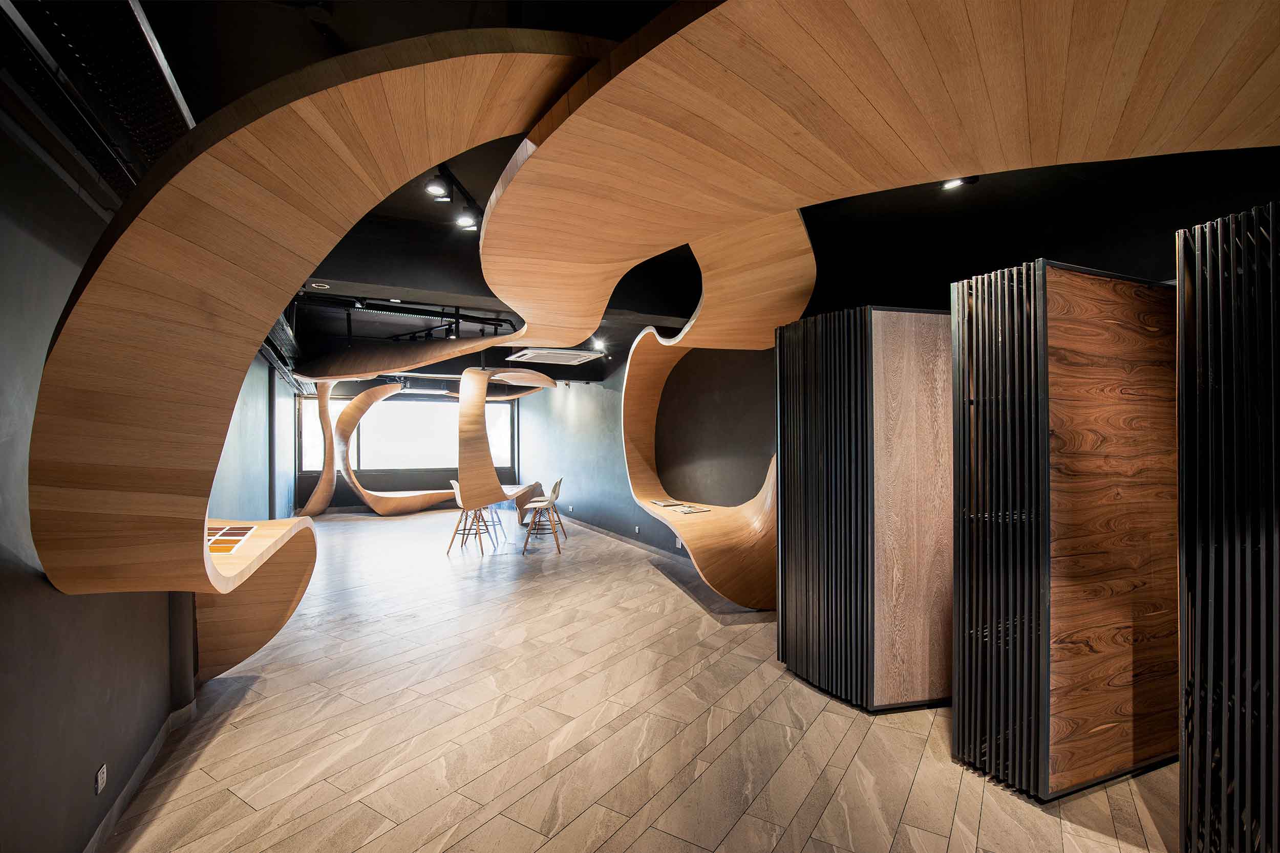
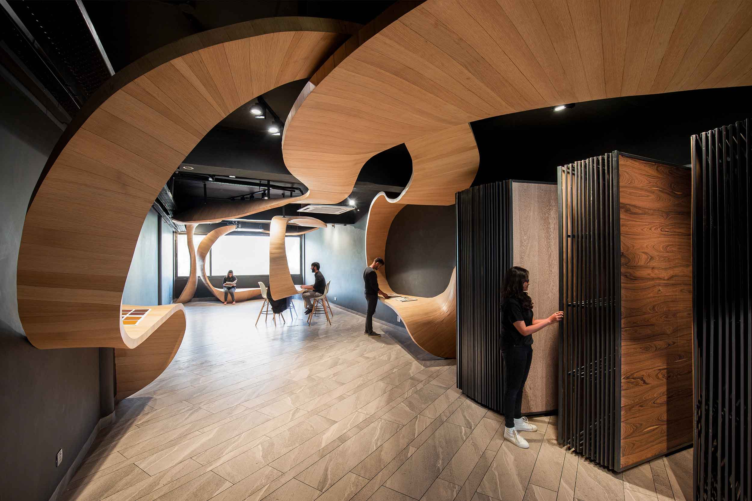
The flowing ribbon translates into more than just an aesthetic element. It serves as a useful device to command movement through the length of the room. Reference coordinates anchored along the room enable a delegation of function by the nature of curvatures the ribbon conceives. Through shape and form, a language is born to facilitate the coordinate functions like a cassette display, multipurpose shelves, sitting spaces, meeting table etc; creating areas that instil a natural flow of movement or pause points that is deviceful in the way the product essentially wants to narrate its story. The seamless continuation of form, function and narration through the length of the showroom manifests,
‘variety in a unified continuum’
anchoring the intervention with a futuristic vision.
A vision that references traditional, cultural and the socio economic evolution of the Indian subcontinent. Voyaging across a time when the use of timber and its carpentry was a glorified and much respected artform, to the present day climate where the material and its craftsmanship is near obsolete. The narrative of Timber Rhyme emphasizes greatly on the need to revive the age-old artistry of wood crafting, in a new and innovative method. Thus bringing together carpenters and technology under one roof to work in unison to produce a ‘show-stopper’ for an intervention.
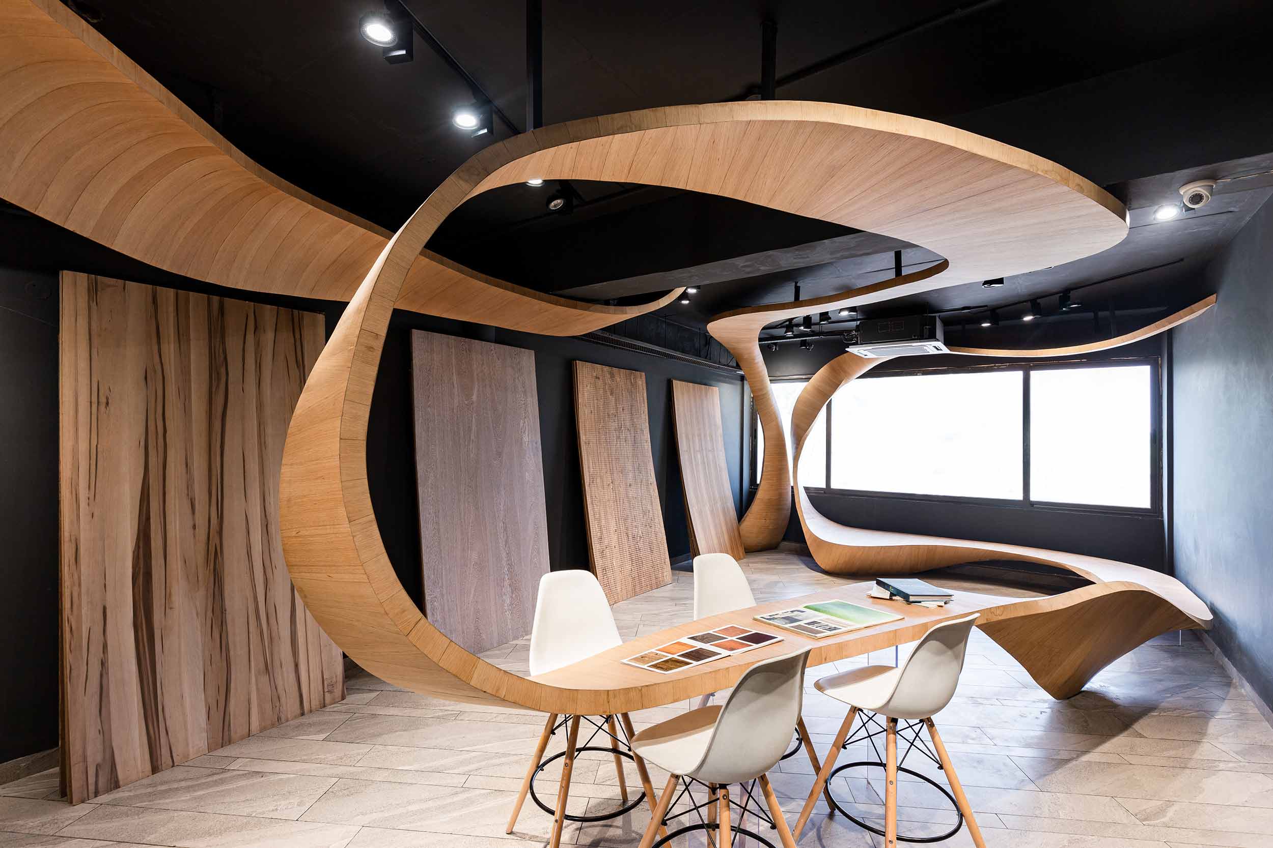
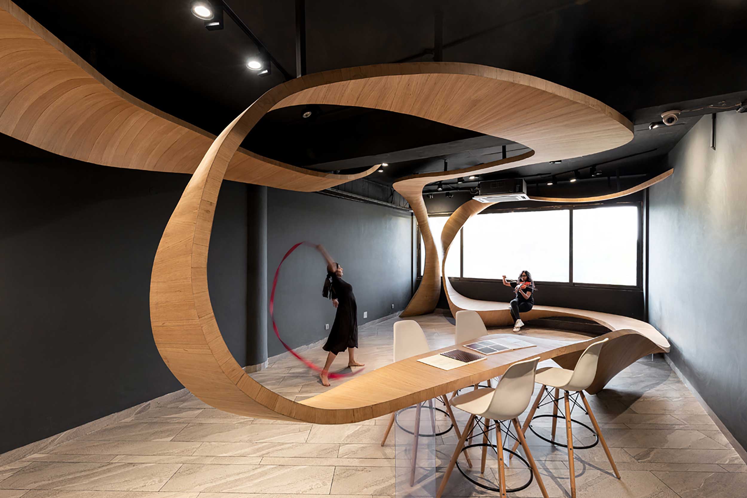
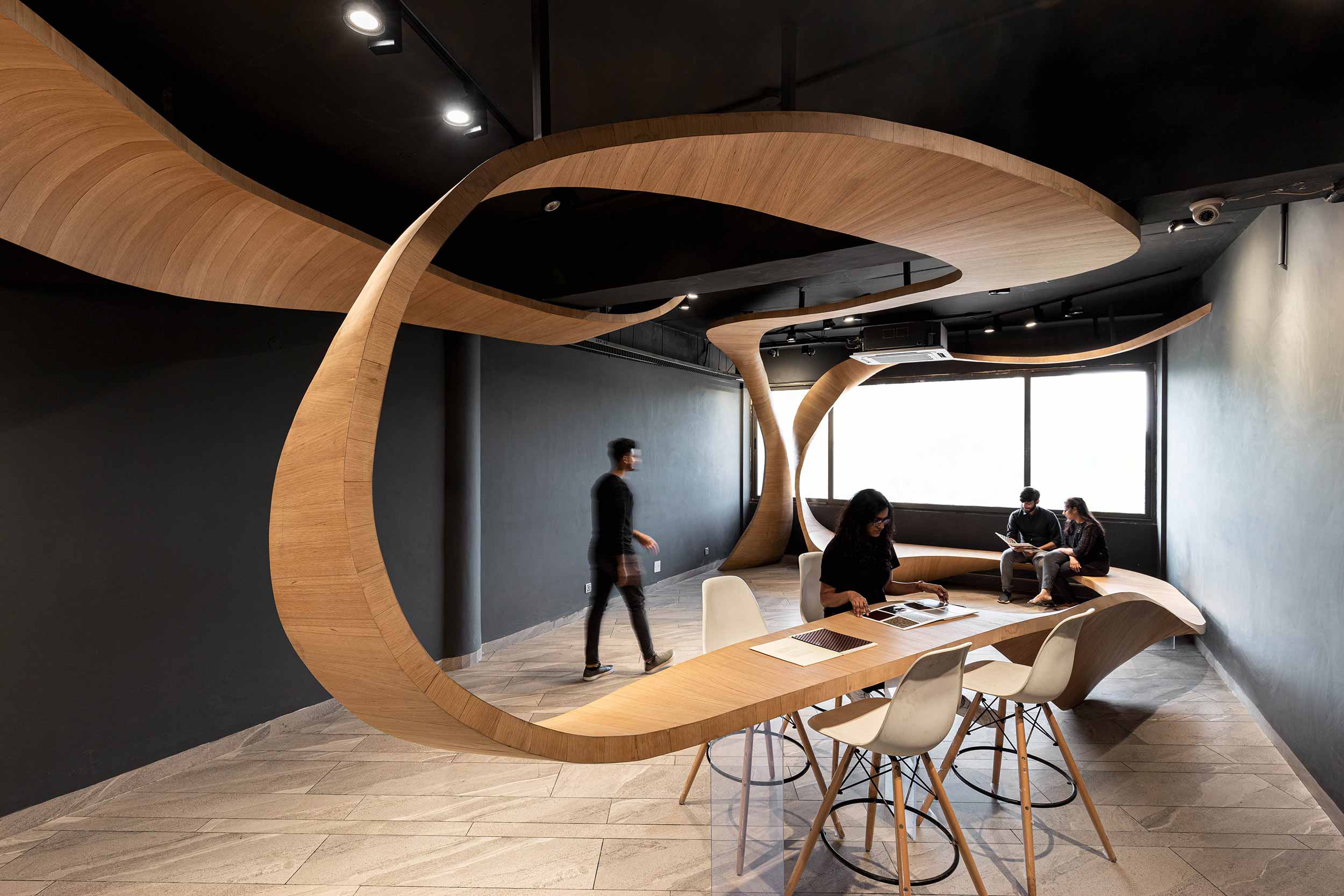
The organic silhouette of Timber Rhyme explores the potentials of veneers and plywood, which are the protagonist products of the showroom. Its anatomy begins with the technologically advanced development of a waffle plywood grid, visualised via Grasshopper (3D visualisation software), subsequently executed by CNC (computer numerical control) milling; and concludes with a finish of flexi-ply and veneer skin, assembled together by manual carpentry. Sporting a light oak veneer, the ribbon sets the commercial stage on fire, stepping into the spotlight gracefully with sensual movements, whilst all else encompassing shuns the limelight with good reason.
Today the intervention artfully captures eyeballs drawing large footfall into the space, inviting further discovery, contemplation and ponder. The amalgamation of sophisticated design engineering and humble craftsmanship pushes the boundaries to showcase an unchartered potential of timber that is lesser visited.
Truly setting ‘timber’, on a conquest with an important message to convey, and to enable a simple 4-walled room to narrate a story that is indeed beyond its imagining.