Let’s select Furniture
Today we are going to talk a little bit about furniture seating arrangements, and what better space can one dwell upon than the pièce de résistance section of any home,
the living room!
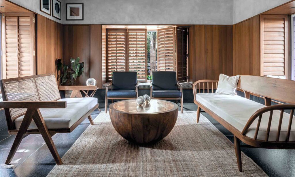
If you like the image above, do visit our feature on T House
Livingroom spaces, the life, the stage, the personality of a home is where one would really spend some time planning its aesthetic canvas. We dive into the nitty-gritty of choosing the largest occupants of the room, the seating arrangement, its types and how to update your canvas with the latest trends.
Today’s trends in seating flip-flops between 2 dominant styles with different messages
The classic three-piece suite plays it safe and ensures a familiar cohesiveness of colour, pattern, fabric and style. ‘Matching’ is its vocabulary, it is less versatile and you can’t go wrong with selecting 3 pieces of furniture that look the same.
But is playing it safe all that exciting?
On a peppier note, a mismatched furniture suite instils a sense of “experimentation” introducing a multitude of elements. Colour pops alongside taupes and neutrals, natural fabrics and handcrafted weaves, rustic textures, a patchy chaise alongside an odd sleek piece of chair or ottoman, are all the rage in this style.
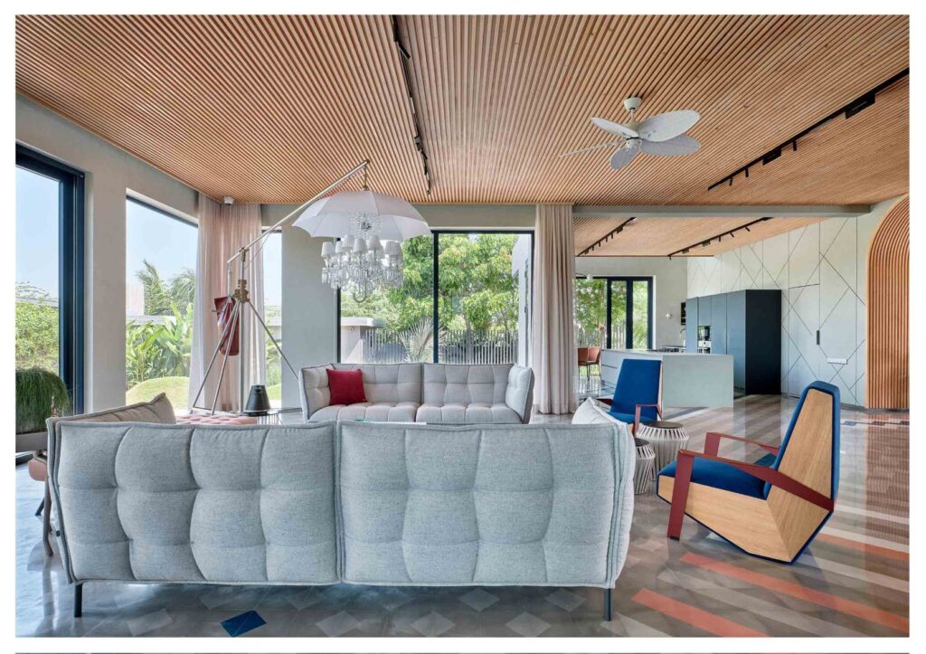
If you like the image above, do visit our feature on Frangipani 14
The good news is that this approach to furniture selection lets you have little of many of your pet design fetishes. It gives you a larger range of aesthetic elements to choose from and most importantly freedom!
Our favourite approach is obvious!
We love that mismatch trends break away from the rulebooks with their playfulness and theatre, and we at DSGN arcHive are indeed rulebreakers at heart!
In this article, we share with you some great ideas on how to step onto our “mismatch bandwagon” to create some really chic living spaces. We also look into stylish renditions of the three-piece suites.
MISMATCH & MORE
The key to mismatch is to have hints of consistency that marries the mismatch suite into one language. These hints could be one or more elements like colour palette, fabric, upholstery prints etc. Let’s dive into some mismatch formulas!
Cohesive Colour Palette
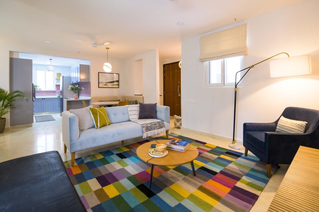
Interior design by Weespaces, Bangalore, India
Consider a base colour palette for your furniture that belongs within the same family of tones. You could consider monochromes, earthy warm, eccentric or cool colour tones etc. This base palette can then be layered with accents and patterns in the form of cushions or furniture throw overs.
Singular Fabric
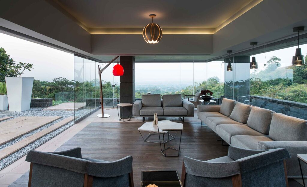
If you like the image above, do visit our feature on Aurelia
Your choice of fabric is one way of creating a singular design language.
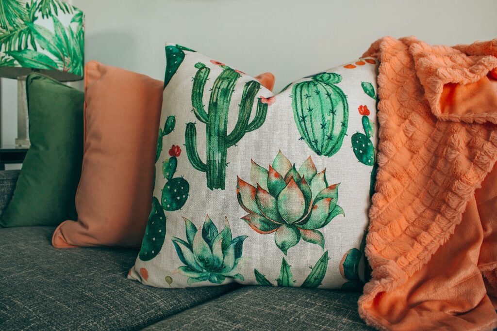
All other aesthetic elements become variants in the composition. In this case, consider choosing texture-rich accessories that are vastly different to the consistent fabric. Additionally play with a range of colours, pattern and furniture style to indeed nurture the essence of mismatch suites.
Dropping small sneaky hints
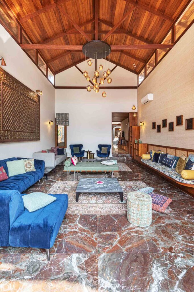
If you like the image above, do visit our feature on House Chirag
We love this approach for the way it shuffles small aesthetic elements of each furniture piece with the other. Almost like a trickle effect of patterns and tones, dropping hints like fabric prints of one furniture piece onto another in the form of accessories and layers is a great way to create this visual tease.
One accent
One piece of furniture sporting the boldest accent can create an extremely theatrical effect, trying to grab all the limelight in a room. Give a bit of love to the rest of the furniture as well by showering hints of the same accent onto them with accessories. For the best impact partner calmer toned furniture with the accented furniture. Whites, taupes, soft greens & sages, beiges & tan, muted greys with undertones are great options to consider.
Consistent material aesthetics but different form
A living room suite definitely looks a lot more vivacious with variations in furniture form. A combination of heavy volume, moderate mass, and sleek is a great way to achieve that.
Sofas, sectionals, chaise, love seats fill a space with great volume.
Retro armchairs, cantilevers, slipper, day beds, pouffes are great options to moderately fill a space.
Ottomans, benches, Scandinavian solid woods complement volume-based furniture with geometry.
A suite that is inconsistent in form can indeed unite beautifully through consistencies in material or finish or pattern & tone.
Three-piece suites with a twist
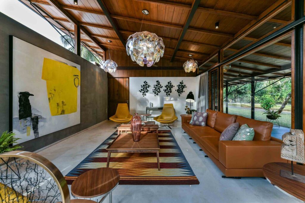
If you like the image above, do visit our feature on The Skew House
Deviate away from the vocabulary a bit and pair the largest piece of furniture with a pair of twin furniture accompaniments. The beauty lies in the variations between the main piece of seating to the twins. The suite can unite by accessorizing and layering, with a shuffle of matching material, texture, tones and patterns.
Eclectic mix
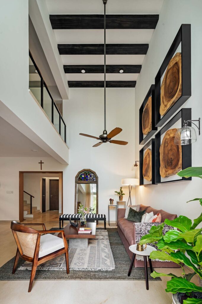
Interior design by Weespaces, Bangalore, India
This wild approach goes bonkers in every aesthetic sense and we love the freedom it instils. Throw the word ‘cohesion’ out of the window and select from a wide range of hues, shapes, textures to your heart’s content. The suite still comes together but with design inconsistency.
So with all the options available to you, go bold, get creative, choose handcrafted, consider faux leathers/vegan materials, and we can’t wait to hear about your living room masterpiece!
Hope this feature was helpful
If you have a mismatch formula you would like to share with us that is different, we would love to hear about it!
Discover similar articles

Why Southeast Asians Are Investing in Homes Abroad

Most Influential Spatial and Interior Designers You Need to Know in Singapore 2025

How to Zone Open Floor Layouts Without Walls

How To Apply The ‘Nudge Theory’ For A Better Lifestyle

Modern Sideboards With a Vintage-Inspired Look

How to Transform Your Home Workstation into a Stylish Productivity Zone

How To Be Creative With Your Living Space Furniture

Why We Love the UOB Card as a Lifestyle Companion
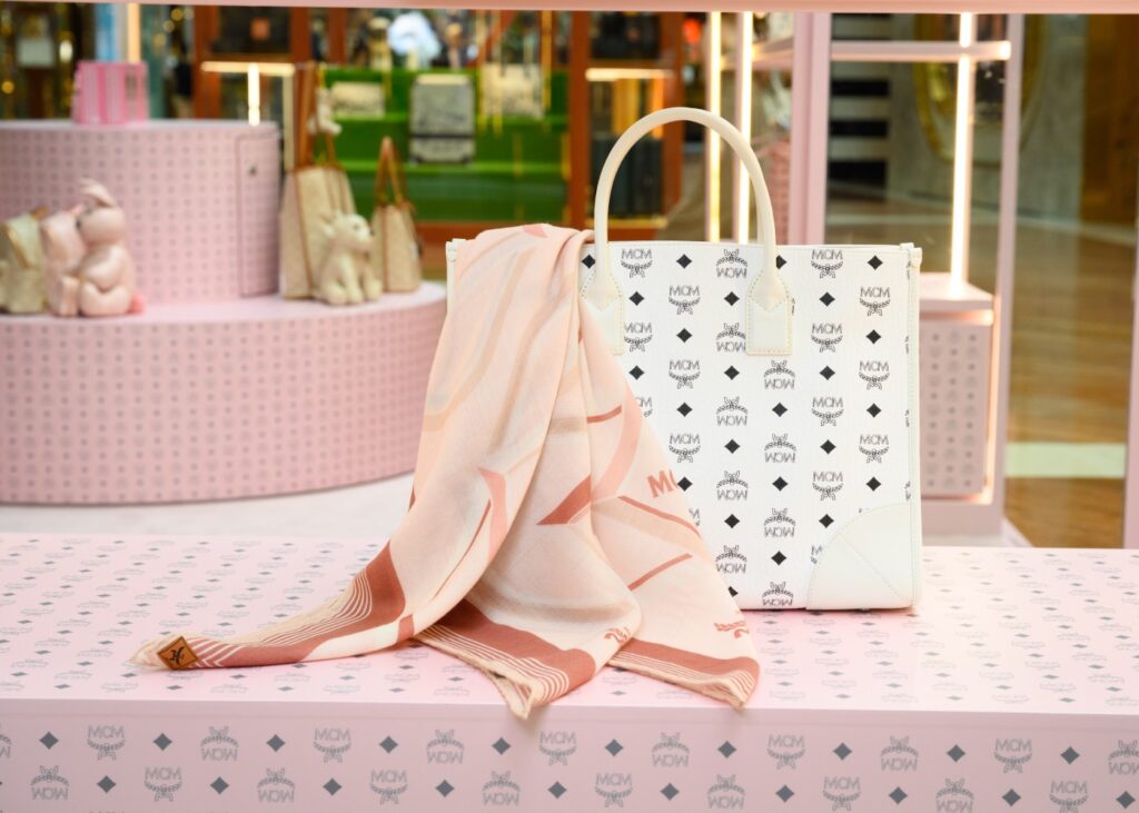
UPDATED! A Shopper’s Guide: Catch the Latest Trends at these Pop-Up Stores

XM Studios: The Ultimate Destination for Comic Book Collectibles in Singapore

Your Guide to Cocktails Inspired by Singapore’s Most Famous Landmarks

Why Emotional Water Bottles Are TikTok’s Latest Obsession for Self-Care and Hydration

Tech Meets Art: The Creative World of Keyboard Customization

An Artistic 21-day Holiday Experience You Don’t Want to Miss

Amazon Prime Day 2024: Your Guide to the Ultimate Home & Decor Savings
Copyright © 2026 DSGN arcHive
