Why Changi Airport Terminal 2 Expansion Is the Ultimate Traveler’s Dream
Published on November 9, 2024 | by DSGN arcHive
We caught up with the designers behind this mega project to offer you an exclusive insight into the creative process and the design journey
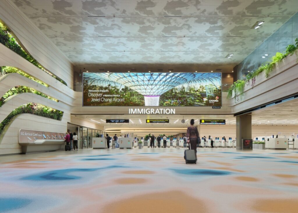
Looking for a travel experience that’s as green as it is smartly designed? The newly expanded Changi Airport Terminal 2 might just be your answer. With an extra 21,000 square meters, this impressive upgrade has made arrivals, departures, and transit zones way more spacious, making every journey smoother and more enjoyable. Completed at the end of 2023, the expansion now allows Changi to welcome up to a massive 90 million passengers each year. Staying true to Changi’s famous garden vibe, the terminal is filled with lush greenery and natural touches, giving travelers a refreshing escape from the usual airport hustle. And here’s the cherry on top—the project recently earned recognition at the Singapore Good Design Awards 2024!
We also had a chat with Law Yoke Foong, Executive Director at RSP Architects Planners & Engineers (Pte) Ltd, who shared the inside scoop on designing a project of this scale. Scroll down for all the details on this award-winning design!
Experience Changi T2: New Green and Spacious Design
1. What was the overarching design philosophy behind the Terminal 2 Expansion project, and how did it align with Changi Airport’s reputation as a leading global airport?
Airport terminals are typically deep and internalized. A common architectural typology, it arose from the need for large assembly spaces and long travel distances between the immigration process. Good design is characterized by scalable, human-centric spaces that are enjoyable for everyone.
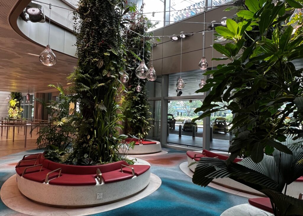
The design of the Terminal 2 Expansion, conceptualized by Boiffils Architectures, has consciously considered this design ethos. The concept of ‘functions set in a garden’ helped to create a stress-free environment for all age groups and profiles. The long terminal building is punctuated with unique landscaped features such as overhead planters, check-in island planters, transit gardens, and hanging greens in the Retail Backstreet, which also serve as recognizable landmarks for intuitive wayfinding. Biophilic design is used as an unintrusive means to pace, guide, and cushion passengers through an otherwise stressful check-in process.
2. How did the decision to add 21,000 sqm of space influence the design elements in the arrival, departure, and transit areas?
The size of the expansion was not the design driver; rather, it was the identification of parts of the terminal to be reorganized, rejuvenated, and expanded. The objective of the expansion was to accommodate an increase in handling capacity by five million passengers per annum, bringing Changi Airport’s overall capacity to ninety million passengers per annum (90mppa). The renewed passenger experience is the key driver.
3. What were the key design features incorporated into the expansion to enhance the passenger experience while maintaining operational efficiency?
Biophilic Features
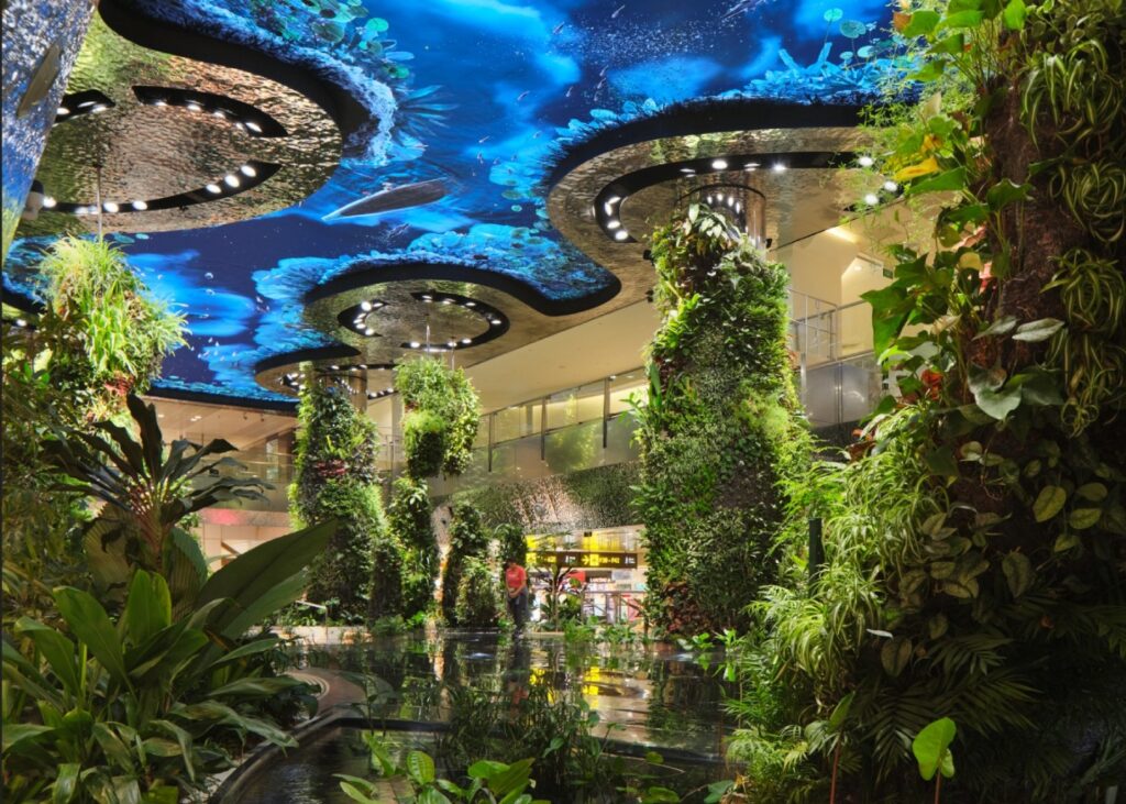
The introduction of several biophilic features within the terminal includes the transformation of the former indoor Orchid Garden in the Departure Transit Hall, which has been replaced by a new garden. This garden features a see-through aquatic pond and a variety of new plant species for the enjoyment of passengers, both young and old. A multimedia ceiling feature digitally simulates an interactive skyscape, enhancing the overall garden experience.
Maximizing Daylight
The increased harnessing of daylight through the replacement of the glass façade allows light to enter while cutting off glare and heat. This larger influx of daylight has enabled the many biophilic features to thrive indoors.
Transformed check-in layout
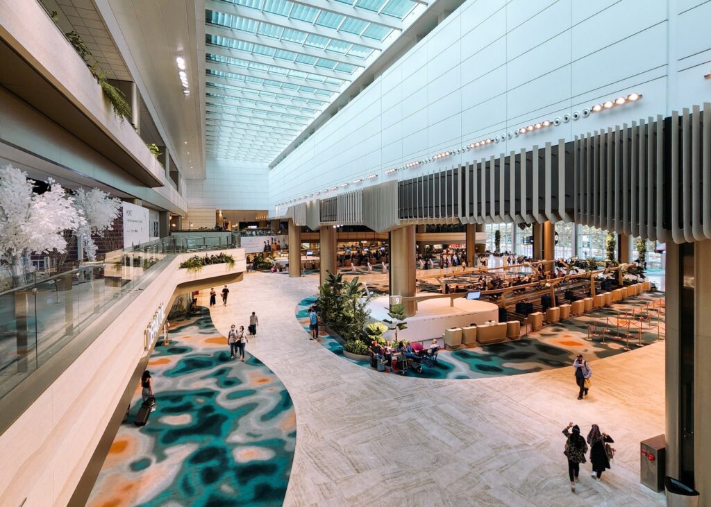
The transformed check-in layout in the departure hall features a spacious, common-use central Fast and Seamless Travel (FAST) zone, with more automated check-in kiosks and bag drop machines. The new orientation of the check-in islands is designed to intuitively direct departing passengers to the departure immigration hall after they have checked in for their flights.
Expanded Immigration Halls
The arrival and departure immigration halls have been expanded and reconfigured with more automated lanes. The introduction of the Special Assistance Lanes (SAL) by ICA also enables travellers with reduced mobility and family groups of up to four persons (e.g., parents with young children) to enjoy the convenience of using the automated immigration process together.
4. Can you discuss any innovative materials or technologies used in the design and construction of the expansion that contribute to sustainability?
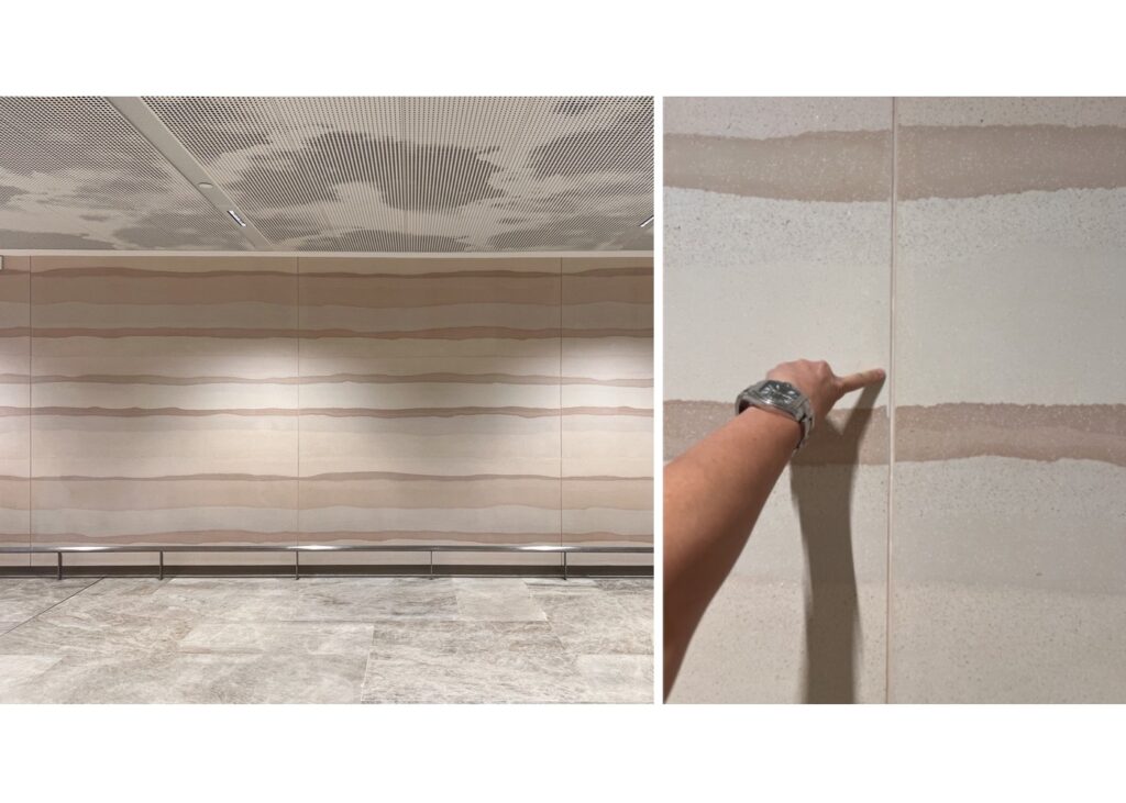
Aside from the answers in (3), the use of a new wall cladding material, Stucco, made with a mixture of gypsum and marble powder, resulted in a unique feature wall. The end product, which resembles strata of earth, is actually a cold-set panel with a low carbon footprint. The prefabricated panels are installed on-site with a pre-approved combination, creating a feature wall that is both unique and sustainable.
The overhaul of the building’s chiller system includes a new chiller plant operating at an efficiency of 0.598 kW/RT, which is above the GM Platinum standard of 0.65 kW/RT. This marks a significant improvement over the existing plant, which operates at an efficiency of around 0.95 kW/RT.
With modularity and precision in mind, the production of the Departure Hall’s curved ceiling baffles was carried out using BIM and 3D software for accuracy, curvature, and dimension, minimizing errors and material wastage.
5. What challenges did the design team face when balancing aesthetic appeal with functionality in the expanded terminal space?
Maintainability and provisions for access in the airport are key to ensuring that the completed design features remain in mint condition until the next refurbishment, usually in about 10 years. There is always a constant dichotomy between purist approaches, such as the larger wall cladding panels and the maximum size that can be serviceable — i.e., using the least amount of manpower or the simplest equipment to remove a panel. In the case of the stucco panels, we have incorporated open joints to address installation tolerances and facilitate the lifting/removal of the panels.
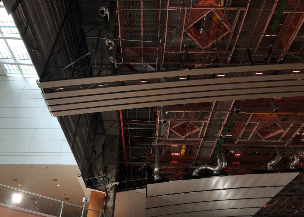
The aluminium ceiling feature above the arrival claim belt was designed to be fully demountable, allowing the CAG team full servicing access to critical systems. The earlier proposal called for more seamless and closely aligned members. However, the design eventually evolved to embrace profiled baffles (instead of slimline ones) that are regularly spaced, in order to accommodate the need for demountability.
To realise ‘Dreamscape’—a LED ceiling that can function like a virtual sky/sea—the traditional fire protection services were relegated to the sides of this feature, cleverly tucked within the coves of the curved steel ceiling. With advanced planning and creative solutions, functionality and compliance became design opportunities that were seamlessly woven into the aesthetics.
6. How do the design features of Terminal 2 cater to diverse passenger needs, including families, business travellers, and individuals with reduced mobility?
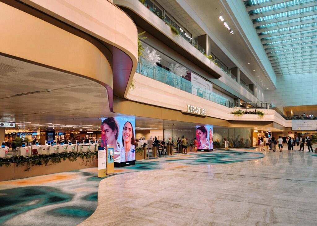
Aside from the earlier design features (including those mentioned for the arrival/departure immigration halls), clear way-finding signs with contrasting colours and large pictograms, as well as digital landmark features, are installed to help passengers and visitors navigate the terminal easily.
Ample seating areas are thoughtfully placed throughout the terminal. All passengers—whether departing, transiting, or arriving—can enjoy comfortable seating in an environment inspired by nature.
Garden-like seating lounges have been created in the arrival meeters and greeters hall, featuring dramatic, double-volume landscaped areas illuminated with soft daylight. Thoughtful touches have been added to the new halls, with resting points equipped with seats of different heights and armrests to ensure diversity and inclusivity.
7. Looking ahead, what lasting impact do you hope the new design of Terminal 2 will have on passenger experiences and the airport's role in the community?
The expansion works have successfully transformed T2 into a more human-centric welcome for passengers. With functional spaces set amidst a lush landscape, the new terminal aims to provide a familiar environment that reflects Singapore’s identity as a City in a Garden. It is a personal wish that the passenger experience remains warm, intuitive, and positive for many years to come.
If you’re traveling to or from Singapore, make sure to check out these spaces through a designer’s lens! Huge thanks to Law Yoke Foong for sharing these incredible insights with us.
If you’re a designer with a standout project ready to make its mark, now’s your chance! Enter the SG Good Design Awards and let your work shine in the spotlight—click the link to find out more!
Wondering what we’re up to next?
Give us a follow and stay in the loop!
About DSGN arcHive
DSGN arcHive is your exclusive key to unveiling the enigmatic essence of a city, all filtered through the prism of design. Far from the ordinary tourist paths. We reveal the city’s architectural marvels, urban intricacies, cultural tapestry, and eco-conscious revolutions that mold its distinctive soul. With us, you’re invited to savor the metropolis in an entirely chic and sophisticated light, a city that’s far more than what meets the eye.
Copyright © 2026 DSGN arcHive


