ARCHITECTURE PERSONIFIED featuring 'Elastica'
- Rohini Gomez Braganza
- No Comments
ARTICLE CONTENTS
PROJECT SPECIFICATIONS
Project Name: Elastica
Project Type: Residential
Project Team: Architects Vikram Rajashekar, Narendra Pirgal and Smaran Mallesh
Built Up Area: 7450 sq ft
Site Area: 2800 sq ft
Site Dimensions: 40’x70’, South facing
Location: Bangalore, India
Project Completion: 2016
Photo Credit: SergioGhetti.com & Cadence
Structural Consultant: B.M. Manjunath


An unorthodox sculpture stands perched in the midst of a stereotypical Indian neighborhood. It embodies quite an outlandish appeal, and is quite alien to the surroundings it has been pitched into. Its virtue is very boldly stated from its aesthetic language, to be the vicinity’s “showstopper”. This sculpture however is quite unlike any other you will come across. It doesn’t just stand to artfully enthral its spectators. It is in fact a family’s very own habitation. The abode is called ‘Elastica’.
A few questions come to mind of such an unconventional piece of architecture that translates itself into a place to be “lived in”.
What is it like for an Architecture to be the centre of attention amidst a stereotypical environment?
What is it like to experience such an architecture and be part of it, day in and day out?
The design of a residence speaks a lot about the occupants, their tastes and mindset of how they perceive themselves. Their choice of spaces, colors, textures, shapes and geometric forms essentially creates the image they wish the outside world to perceive them as. When an Architecture is designed to match one’s lifestyle choices, it inadvertently manifests their inner personalities.
Let us immerse ourselves into the Architectural personality of ‘Elastica’, and understand the premise for its inspiration.
ELASTICA
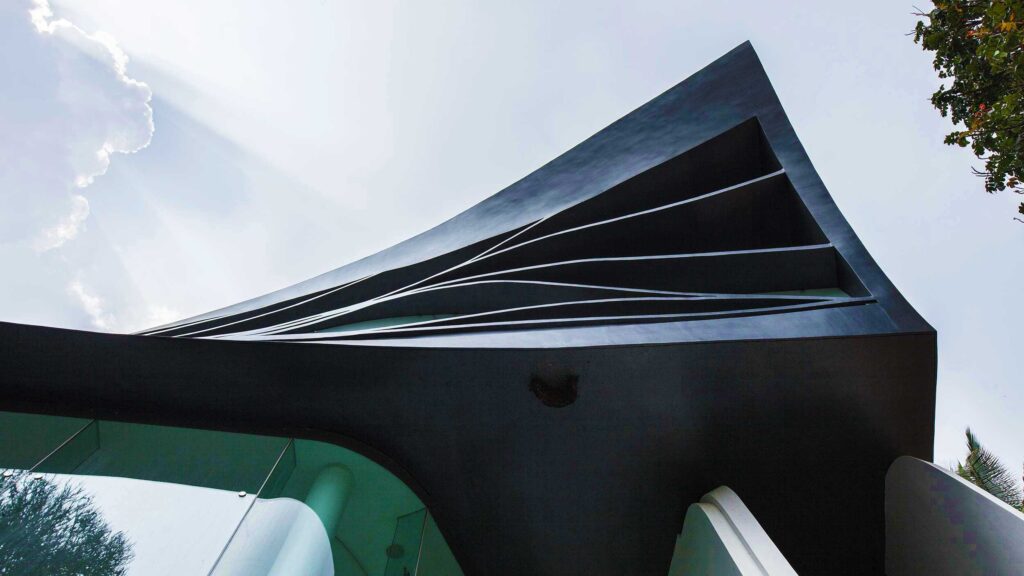
A few words come to mind when a spectator confronts ‘Elastica’. ‘Star Wars’, a ‘space escapade’ or ‘an amoebic landscape’. It is indeed a visual that naturally transports one into the unknown, which is what is most intriguing about its appearance.
Outside
Appeal
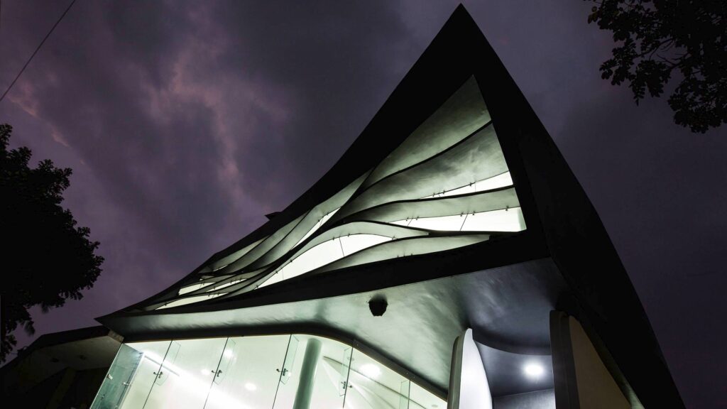
‘Elastica’ is visually an extremely playful presentation of Architecture. The biotic appearance of the building seems exaggerated, like an exercise with pliable clay dough. It appears manually manipulated into playful twists, pinches, prods to arrive at its uniquely sculptural formation.
Design Approach
The design intervention was approached in an unconventional method. Unlike most buildings where the 3-dimensional elevation is developed from floor plan layouts, Elastica’s was developed from its fluid-like sectional profile. In an attempt to sensually connect all the floor levels into one single entity, the designers conceptualised a looping ribbon-like profile with the floor slabs and staircases. Initiating a continuous ribbon loop from the basement and terminating it at the apex, the terrace level.
This flowing ribbon-like profile inspires the exterior and interior features of the architecture which is indeed avant garde.
Treatment
Each level of the building has a different language of external finish.
The ground and first floor levels form the bulk of the external massing treatment. It is gently elevated off the ground making it look more dramatic midst levitation.
The Ground floor level is extensively glazed with curtain wall systems and undulating ferro-concrete features. Its eastern elevation captures the essence of the building, framed into an expansive curtain wall system. The photographic image manifests a contemporary and natural flow of interior spaces from living to dining areas.
The First floor level is draped delicately with ferro-concrete contours which are glazed intermediately. Giving it a mosaic, veil-like appearance.
The Second floor level comprises a composition of spill out turf decks encompassing an enclosed room.
Materials
A careful orchestration of contemporary materials gives the holistic look an element of finesse. It comprises spider clamp curtain walls, glazing, ferro-concrete features.
Inside
‘Elastica’ is a 4bhk residence. It accommodates a spacious living-dining-kitchen with a zen garden, a home theater, and an open air terrace amphi-theatre with spill out decks and meditation space.
Appeal
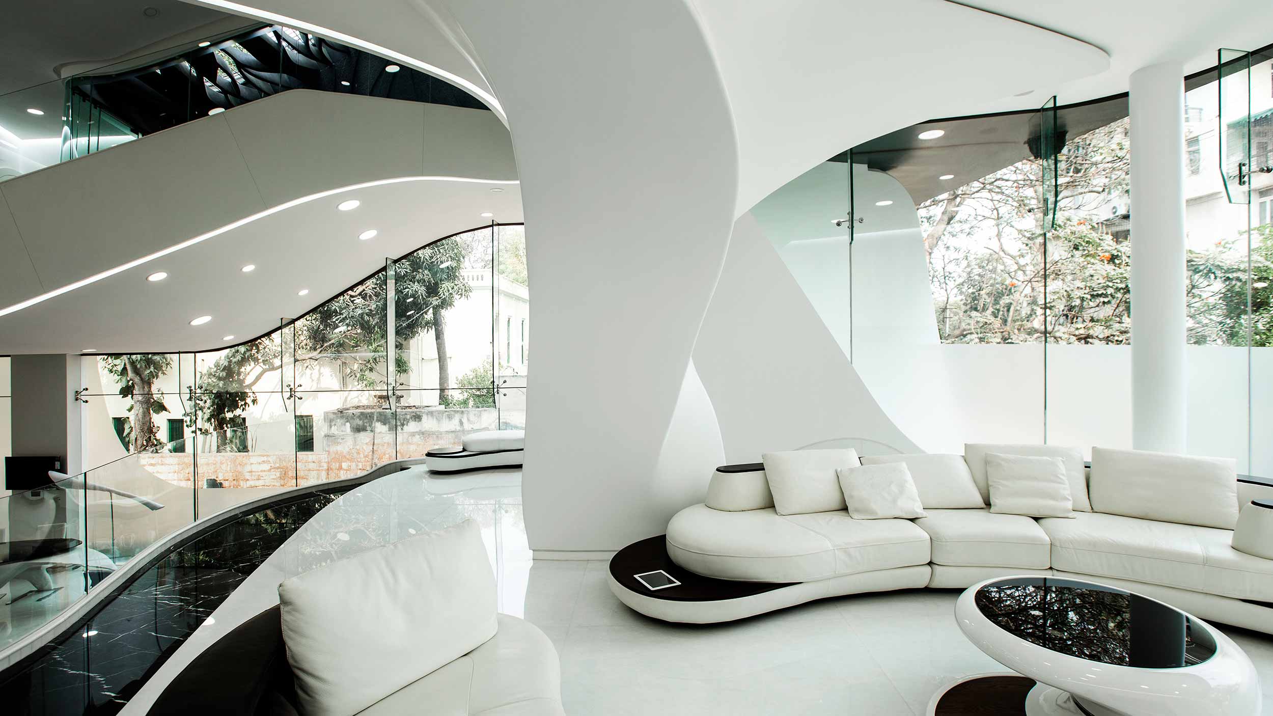
The fluid-like appearance of the building does not limit itself to the exterior finishes. It even resonates in the interiors of the house. As part of the concept, the floor plans and walls sport a very organic profile in layout and elevation. All spaces further adhere to the concept as seen in the bespoke furniture and furnishings.
A noteworthy approach to the design is the finishing treatment given to columns central to spaces. Most spaces on all the floors maintain an open layout. With large open expanses of floor slabs extending across the length and width of the site, structural columns obstruct within the living spaces. To make them merge seamlessly into the concept the designers embraced them into artful sculptures, adding a bit of character to the space. A few columns also have furniture or counter top protrusions that are quite amoebic in appeal, making them naturally part of the arrangement.
The bespoke interior furnishings such as cabinets, ledges, and furniture including chairs, beds, outdoor terrace benches etc, emulate the circumambient architectural landscape. Making them appear like natural procreations of the Architecture itself.
Materials
To achieve such outlandish interior features, ferro concrete was used extensively. Marble floors and countertops beautifully reflect the room’s plethora of shapes and forms. Transparent balustrades and barricades used for staircases, floor landings and spill out terraces, naturally dissolve into the space. This strategic toning down with the use of a transparent medium, enables a spectator to focus on the holistic composition of the house itself.
The fluid like profile achieved in the furnishings that blend in with the architecture is achieved with ply and solid surface acrylic.
Colors
The interiors showcase a bold black and white palette that resonates on all floor layouts. This minimalistic palette gives room for vibrant accents of greens and blues in wall paint features or decor that pep up the spaces in a great way.
ARCHITECTURE PERSONIFIED
Architecture is not always about adapting to the local culture or merging with the landscape. Its greatness cannot always be measured by how effectively it functions and how people-compatible it can be.
Architecture in fact can be great when its manifestation successfully exemplifies human personalities. Capturing the essence of a creator in form and shape, personifies Architecture in the most distinctive fashion. Some of the most commendable Architectural works across the world showcase vibrant personalities of either its designers or owners. These design interventions were kindled from the soul, making them more conceivable in appearance. This is why their legacy gets carried forth into contemporary times for setting an example, being unique, daring and especially for being different from the crowd.
Elastica is a unique representation not only for its endearing and daring design-engineering, but is indeed the most honest reflection of its inhabitants.
In my view, they are a bold tribe, they are a people with outlandish tastes, they are fearless, trend setters and indeed the most contemporary…………………
RULE-BREAKERS of our times!
…………………………………………………………………………………………………………………………………..
Project drawings, specifications & Photography provided by the respective Architecture Firm
Analysis & Article written by-
Architect Rohini Gomez Braganza
